Showing posts with label Case Study. Show all posts

Tuesday, 18 March 2014

Classic Monsters Case Study #4: The Devil


Better to reign in Hell, than to serve in Heaven.” 
John Milton, Paradise Lost

The last of the 'Classic Monsters' is one we are all familiar with. Originating from the texts of Abrahamic religions (Judaism, Christianity, Islam and their respective derivatives), the Devil is the personification of evil, the ruler of Hell and the mortal enemy of God. He is known by several names, including Lucifer, Sammael and Iblis, but he is commonly referred to as Satan (a Hebrew word  meaning 'adversary' or 'accuser').

He is widely believed to have once been the highest and most beautiful of God's angels. However, he grew vain and prideful and began to believe he was better than his creator, causing him to lead a rebellion to usurp God. Ultimately, he was defeated and cast out of Heaven and imprisoned in Hell, where he plots to subvert and corrupt God's creation in revenge. There are some different versions of this tale: some versions state the reason he rebelled was that he refused to bow down to humanity, who he saw as flawed and unworthy, while Islam portrays him as a Jinn rather than an angel. 

Surprisingly, the idea of the Devil as the embodiment of evil didn't actually originate from the Hebrew Bible; though the name 'Satan' does turn up a few times in the Old and New Testaments, it is never stated to be the same being, with the name being used more as a title than an individual, and the character is depicted more as a trickster than an antagonist. The closest the Bible comes to depicting the archetypal Devil is through the dragon or serpent who appears in the Book of Revelation, but again the original text never outright identifies this beast as Satan. More recent interpretations, such as the King James Bible, retcon this by claiming these and other events are all really the Devil himself, but these versions all come about after the archetypal Devil had been established.

The Devil as we know him actually came into being during the Middle Ages, perhaps as an attempt to vilify the deities of pre-existing pagan religions as Christianity spread throughout Europe. This was done by portraying these pagan gods as alter-egos or familiars of Satan, which likely influenced the classic image of the Devil. It was also this period that the moniker of 'Lucifer' is supposed to have first appeared; a romanisation of the Hebrew word 'heylel', it means 'shining one' or 'morning star'.

The Devil has made several appearances in popular culture, and as a result he has been given a wide variety of design. Some give him a human disguise with some clue that gives away his true identity (usually the colour of his clothes or eyes), while others base his appearance on his status as a fallen angel. For the most part, however, he is classically depicted as a horned demon, usually with a trident, wings and goat legs. As mentioned before, this design seems to have originated from old pagan deities, many of whom were horned and had goat-like features. His trademark colours seem to be either red or black.

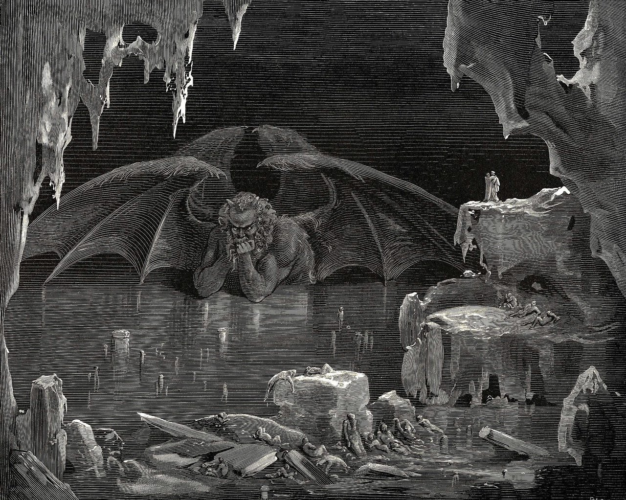
Engraving of Satan trapped in Hell by Gustave Dore, inspired by Dante's Inferno
One notable exception is the Satan that appears in Dante Alighieri's Divine Comedy; imprisoned in the lowest circle of Hell, this version of the Devil is described as a colossal, feral beast with three faces and six wings, trapped waist-deep in his own frozen tears. In an interesting subversion, this Satan is not depicted as the ruler of Hell, but instead as it's first prisoner. He is also presented as mindless, stripped of his former beauty and completely impotent, unable to do anything but beat his wings in a vain attempt to escape, which is a complete contrast with how he usually appears.

For my design, I'm going to try to stick close to the 'classic' Devil, as he is the more instantly recognisable of Satan's various incarnations and his design fits my 'iconic character' criteria better than the others. I may, however, add elements of the other versions. Aside from that, who knows what I'll come up with?

Saturday, 8 March 2014

Classic Monsters Case Study #3: Medusa

"Medusa was beautiful once, so beautiful as to tempt Poseidon. When he came for her, she ran to Athena's temple thinking that the goddess would protect her. She didn't. Poseidon took her on the cold floor. She prayed to Athena for comfort but the goddess found nothing but disgust. She made sure no one would ever want Medusa again, one look at the creature she has become would turn any living thing to stone." - Io, Clash of the Titans (2010)

Anyone who knows even a little bit about Greek mythology has heard of Medusa. A hideous monster with snakes for hair and whose gaze can turn living things to stone, she and her sisters Euryale and Stheno are collectively known as the Gorgons, which derives from the Ancient Greek word gorgós, which means "dreadful" (fitting, considering how ugly they supposedly were).

Medusa's tale is actually something of a tragic one. She was originally just an ordinary human woman, who had the misfortune of being noticed by a god; the sea god, Poseidon, took a fancy to her, and in his lust he raped her in the Temple of Athena. Ever the sympathetic goddess (sarcasm), Athena decided to punish Medusa for having the audacity to be violated within her temple, and so she transformed the poor woman into the monster she is known as today. To add insult and injury to this considerable trauma, she was later hunted down and killed by the hero Perseus, who, using a mirror to look at her reflection instead of facing her directly, choped off her head to present to a pompous king. All in all, Medusa had it pretty rough...
A carving of a classic depiction of a Gorgon

Medusa, as she appears in Clash of the Titans (2010)
Despite how well known she is, Medusa has something of an identity crisis regarding her appearance. Classical depictions of the Gorgon depict her as an ogre-like creature, with scaly skin, bronze claws, tusks and wings in addition to the snake hair. More recent depictions, such as the film Clash of the Titans and the God of War franchise, show her with the lower body of a snake, similar to a naga or a lamia, and make her features more serpentine. There are also a lot of versions where her facial features remain human and even vaguely beautiful, which completely contradicts her 'hideous' description. Between these various designs, there are only two constants: the snakes-for-hair and the petrifying gaze.

Not a hundred percent sure where I'm going to go with this one. On the one hand, I'd like to try something closer to the original ogre-like depiction, as I think it'll stick out more from the other designs currently out there, but at the same time I feel the naga-like design that most people associate her with fits more. i do know that I want to push the 'tragic' side a bit. I dunno, time will tell what I come up...

Monday, 24 February 2014

Classic Monsters Case Study #2: Cthulhu

"In his house at R'lyeh,
dead Cthulhu waits dreaming."

The most well-known of horror writer H.P. Lovecraft's creations, Cthulhu is one of the Great Old Ones, a group of powerful, primordial and malignant cosmic entities that are said to be present on Earth. Cthulhu himself lays dormant within an underwater city in the South Pacific called R'lyeh, where he waits to be awakened and let loose upon the world again. Despite his imprisonment, however, the elder god is apparently the source of constant anxiety for mankind at a subconscious level, and also the subject of worship by a number of human religions. 

The monstrosity makes his first appearance in Lovecraft's 1928 short story, The Call of Cthulhu, which details the discovery of the elder god's existence, encounters with a cult that worships him and finally the accidental release of Cthulhu himself at the story's climax. There are also several references made to the entity in later works of Lovecraft's so-called Cthulhu Mythos, many of which suggest vague links to other such entities. It is interesting to note, however, that while Cthulhu is certainly the most well-known of Lovecraft's fictional deities, he is not the most powerful; that honour goes to one of the Outer Gods, such as Azathoth, Nyarlathotep and Yog-Sothoth.
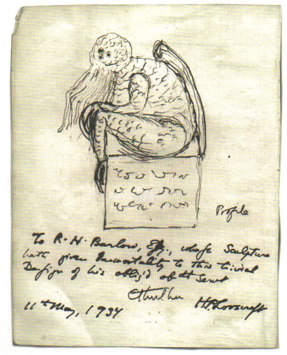
A sketch of Cthulhu by H.P. Lovecraft in 1934
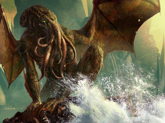
Cthulhu is consistently described as a mix between a giant human, an octopus, and a dragon. Typical depictions show an octopus-like head, and a vaguely humanoid body with large, rudimentary wings. Lovecraft himself describes the elder god as "A monster of vaguely anthropoid outline, but with an octopus-like head whose face was a mass of feelers, a scaly, rubbery-looking body, prodigious claws on hind and fore feet, and long, narrow wings behind." Other references to the creature's appearance note that the  "thing cannot be described," but it is called "the green, sticky spawn of the stars", with "flabby claws" and an "awful squid-head with writhing feelers." The character that meets Cthulhu face-to-face also uses the phrase "a mountain walked or stumbled" when describing its movement, which gives a sense of scale to its size.

Yeah, I'm probably going to give this guy the 'Guillermo del Toro' treatment

Wednesday, 19 February 2014

Classic Monsters Case Study #1: Jabberwocky


'Twas brillig, and the slithy toves
Did gyre and gimble in the wabe;
All mimsy were the borogoves,
And the mome raths outgrabe.

"Beware the Jabberwock, my son!
The jaws that bite, the claws that catch!
Beware the Jubjub bird, and shun
The frumious Bandersnatch!"

He took his vorpal sword in hand:
Long time the manxome foe he sought—
So rested he by the Tumtum tree,
And stood awhile in thought.

And as in uffish thought he stood,
The Jabberwock, with eyes of flame,
Came whiffling through the tulgey wood,
And burbled as it came!

One, two! One, two! and through and through
The vorpal blade went snicker-snack!
He left it dead, and with its head
He went galumphing back.

"And hast thou slain the Jabberwock?
Come to my arms, my beamish boy!
O frabjous day! Callooh! Callay!"
He chortled in his joy.

'Twas brillig, and the slithy toves
Did gyre and gimble in the wabe;
All mimsy were the borogoves,
And the mome raths outgrabe.

A nonsense poem written by Lewis Carroll, Jabberwocky tells of a young man who ventures into a strange, dangerous forest to kill the titular creature that lives there. It originally appeared in Through the Looking Glass and What Alice Found There, the sequel to Alice's Adventures in Wonderland (1865), and as such the creature, along with other elements from the poem, often features in works based on Alice in Wonderland.

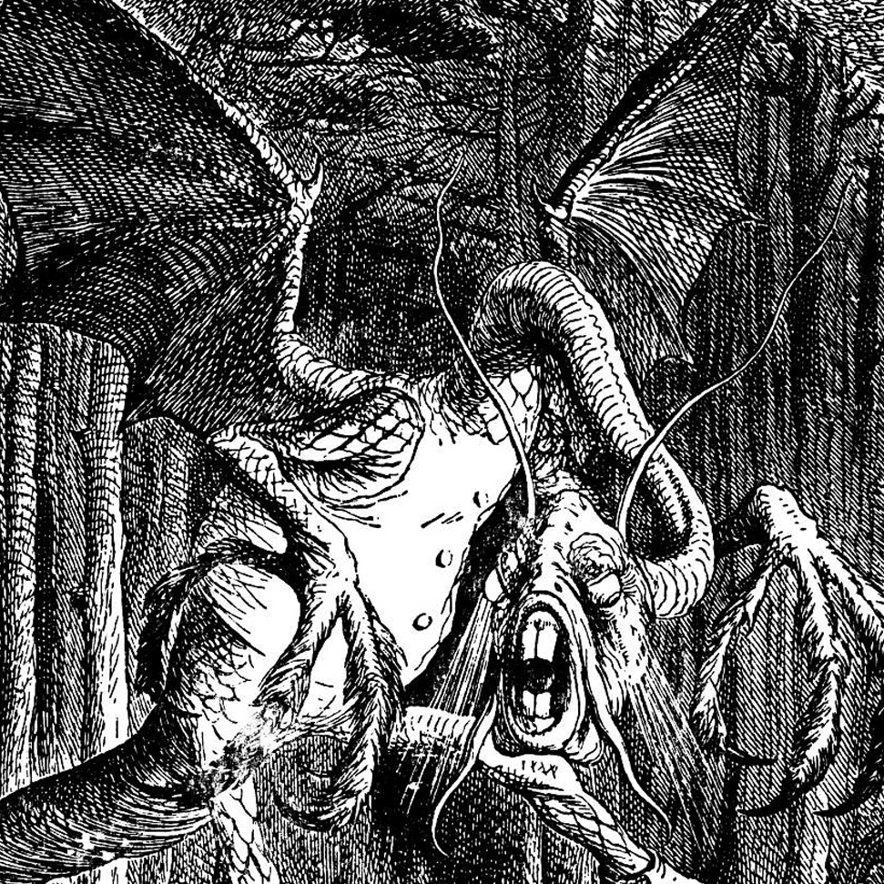
The Jabberwock itself is described sparingly, with only a few details given about its nature and appearance, and many of the words used to do so are made up (it is a nonsense poem after all). As such, most depictions of the monster are based on an illustration from Through the Looking Glass by John Tenniel (seen above).

For my own Jabberwock design, I decided to dissect the poem and base my concept off what little I could gleam from it... which, surprisingly, was quite a lot. For one thing, I found that the poem mentions nothing about it having wings or even flying. I also noted the following:-
  • The jaws that bite - The fact that the poem draws attention to them suggests that the Jabberwock's jaws are quite noticeable, and like it likes to use them
  • The claws that catch - Suggests the creature likes to grab it's prey, which in turn suggests long, dextrous limbs
  • Long time the manxome foe he sought - The key word here is manxome, one of the many nonsense words used. Apparently it means 'fearsome', but it's also a portmanteau of 'manly' and 'buxom'
  • With eyes of flame - Again, like the mouth and claws, this suggests the eyes are quite noticeable, probably because they are large and possibly glowing
  • Came whiffling through the tulgey wood - Despite being another nonsense word, describing the Jabberwocky's movements as 'whiffling' is actually quite telling. It doesn't sound like something that crashes through the trees or comes swooping down; instead it almost sounds like its slithering or gliding.
  • And burbled as it came - More of a minor detail really, but as with 'whiffling', the choice of words suggests something about the creature. It's not loud or shrill, suggesting the creature may be slowly stalking its quarry
  • and with its head - It has a clearly defined head. ...Ok, I'll admit, I'm grasping at straws with this one
Anyway, that's enough research and exposition. Next post will show the concept and design of the Jabberwock

Thursday, 14 November 2013

Redesign Case Study #4: Tomb Raider

Genre: Action-Adventure
Developer: Crystal Dynamics, Eidos Montreal (Multiplayer)
Publisher: Square Enix
Platform: PlayStation 3, Xbox 360, Windows
Engine: Modified Crystal Engine
Release Date: 5 March 2013


Since her debut in 1996, the Tomb Raider series' protagonist, Lara Croft, has long been the most well-known of gaming's few female icons. She has often been described as lady version of Indiana Jones, with many of her adventures being spent exploring the ruins of ancient civilisations and legends and unlocking their secrets, hence the name of the series. However, after years of mediocre sequels and failed attempts to breathe fresh life into the franchise, it's fair to say that Lady Croft has lost a lot of her prestige.

Enter this year's Tomb Raider, a reboot of the franchise in the same vein as Ninja Theory's DMC: Devil May Cry. Framed as an origin story, the new game opts for a more serious, grounded approach to that of it's predecessors, with a major focus on survival. To reflect this, the developer has given Lara a complete overhaul, giving her realistic proportions and making her more vulnerable. However, she still possesses enough of the old design that she isn't completely unrecognisable; she still has her trademark ponytail and a blue top reminiscent of her first appearance.


How did the Fans react?
For once, we have a redesign that the fans DIDN'T throw a hissy-fit over. In fact, if anything, they rejoiced! While the old Lara Croft was indeed an icon, it's pretty clear that she meant to be some 12 year-old's fantasy Playboy girl; her stereotypically disproportionate body, with the comically oversized breasts (reportedly a result of a modelling mistake that was never fixed) and skin-tight hot pants, are obviously intended to pander to a male audience, and while she has undergone some minor changes, she's never once been intended as anything more than eye candy.
At the time of her debut, this made sense, as the gaming audience in the 90s was predominantly male. Since then, however, there has been a dramatic rise in the number of female gamers, who now make up around half of the overall audience, and with them has come a change in attitude. The simple fact is that the the old, sexist design is considered to be something of a joke these days. Naturally, this means that this more human, realistic rendition of Lara was much better received than the caricature that preceded here.

Personal Verdict
In case the tone of this particular post hasn't already given it away, I'm very much in favour of the redesign. The fact is, the old design was at best a caricature and at worst an example of just how badly women are often represented in this media. By contrast the new Lara, as with DMC's Dante, is more like an actual human being, both in her overall design and personality, which makes it much easier to relate to her throughout her struggles.

Wednesday, 13 November 2013

Redesign Case Study #3: Bomberman: Act Zero

Genre: Action
Developer: Hudson Soft
Publisher: Konami
Platform: Xbox 360
Release Date: August 3, 2006

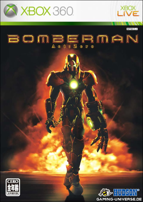
Released at the dawn of the last console generation, Bomberman Act Zero was a radical reimagining of the classic Bomberman design. Abandoning the classic cartoonish look of White Bomber, the new game instead took inspiration from the original game's boxart and portrayed it's characters as mechanical cyborgs. It is clear that this departure was an attempt to make the series 'darker, grittier and edgier' so as to appeal to a more adult audience.

How did the Fans react?
The game has been universally reviled, by fans and critics alike, and is widely considered to be terrible in all it's aspects, from presentation to gameplay. In fact, there is some debate as to whether this game is in fact worse than the infamous Sonic 2006, which was released around the same time. It's clear that, unlike other redesigns like DMC: Devil May Cry, the negative reaction is due to the sheer poor quality of the game rather than the fact that they changed it. Needless to say, this particular incarnation of Bomberman has not been seen since...

Personal Verdict
Good lord, what fresh hell is THIS?! Seriously, look at it, it looks like gimp!
Honestly, this is one of the worst designs I've ever seen! It's awful!

Redesign Case Study #2: DMC: Devil May Cry

Genre: Action-Adventure, Hack & Slash
Developer: Ninja Theory
Publisher: Capcom
Platform: PlayStation 3, Xbox 360, Windows
Engine: Unreal Engine 3
Release Date: January 15, 2013


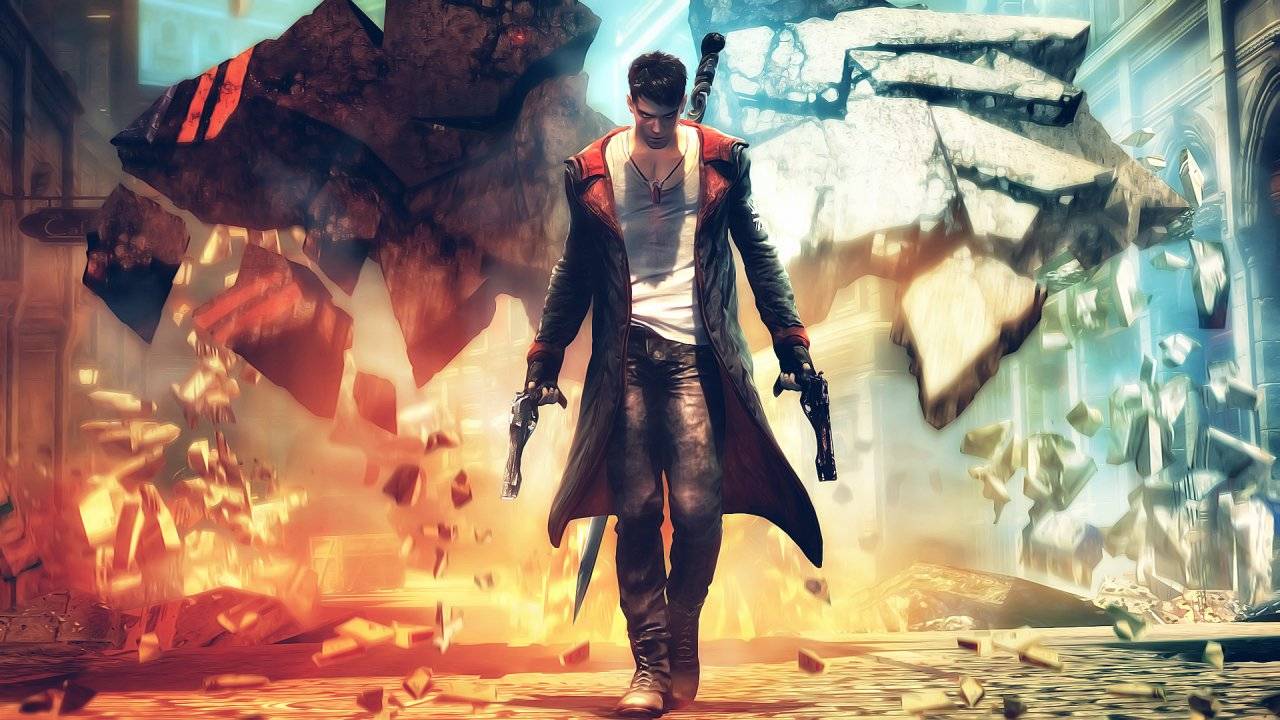
DMC: Devil May Cry is a reboot of Capcom's popular Devil May Cry series by Ninja Theory. The game was requested by Capcom themselves as they wanted the new game to be made from a Western perspective in the hopes that it would stand apart from its predecessors. The result was a more realistic, and grounded game in contrast to the over-the-top antics of previous Devil May Crys.

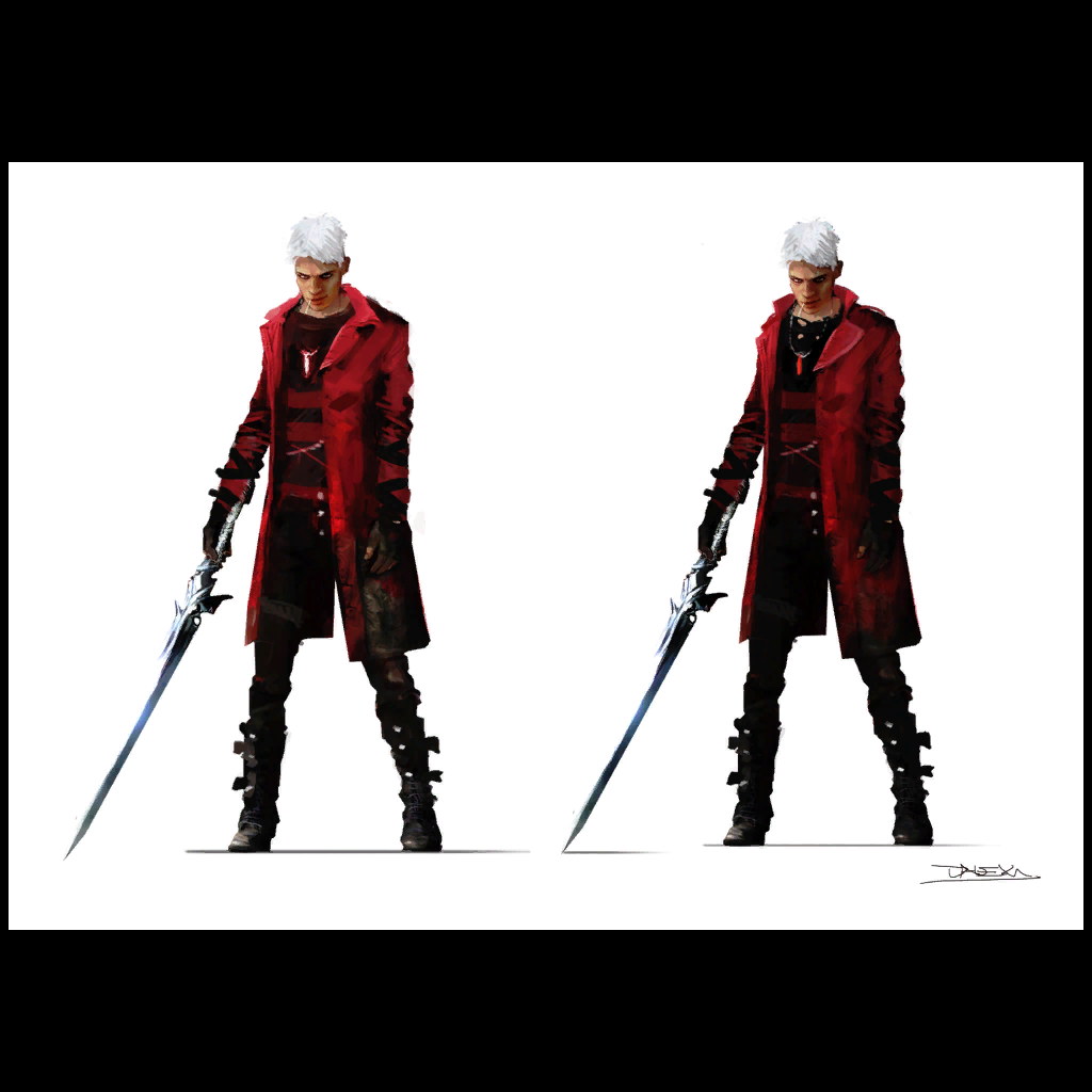
The biggest change present in the reboot, however, is the protagonist, Dante. In previous DMC games, he is easily recognisable by his long white hair and trademark red long coat. In the reboot, however, his appearance is radically different, now sporting short, black hair and a shorter black coat with red highlights. He's also a lot younger than his counterpart, which fits as the reboot is essentially an origin story. At the end of the day, however, he still retains many traits from the old Dante; he still wields his sword Rebellion and guns Ebony and Ivory (albeit all with new designs to fit the setting), he still wears a coat and he still spends much of the game fighting demons. It should also be note that his hair gradually turns white throughout the game, and both his hair and coat revert to their original colour scheme when the Devil Trigger ability is used, so it's clear that the original Dante has not been completely forgotten.

How did the Fans react?
To describe the fan reaction as unpleasant would be an understatement; initial reactions to Dante's redesign were overwhelmingly negative, as fans felt that the redesign was far too removed from the original design and some thought that the new Dante was overly crude and 'edgy' for the sake of it. This reaction can largely be attributed to the initial reveal trailer, which, in all fairness, did indeed portray the redesigned character as overly crude and 'edgy' for the sake of it.
In the months leading up to the game's release, however, it became apparent that the reboot still retained several aspects of the original's personality and opinions began to change, with some fans growing to like the new Dante. However, a percentage of the series' fans still despise it even to this day, with some refusing even to play the game. So, at the end of the day, reception towards the new design remains mixed.

Personal Verdict
Personally, I've never really a big fan the old design for Dante. It's not that he has a terrible design or anything and he does fit in with the setting of the games he appears in, but to me he's always come across as some stereotypical Shonen anime character (hell, he even HAS his own anime!), and while I can see why some others would like this, it's never really done anything for me.
The new Dante, on the other hand, is a lot more appealing to me. He just feels a lot more grounded and more like an actual person. A crude, cynical asshole of a person, granted, but a person nonetheless. Sure, the story can be overly anti-establishment at times, but that one's more on the writing than the character design. I will admit that as a massive fan of Ninja Theory, my opinion is probably pretty biased here, but as far as I'm concerned the new Dante is a superior design to the old one.

Monday, 11 November 2013

Redesign Case Study #1: The Legend of Zelda - The Wind Waker

Genre: Action-Adventure
Developer: Nintendo EAD
Publisher: Nintendo
Platform: Nintendo Gamecube, Wii U (HD rerelease)
Release Date: December 13, 2002


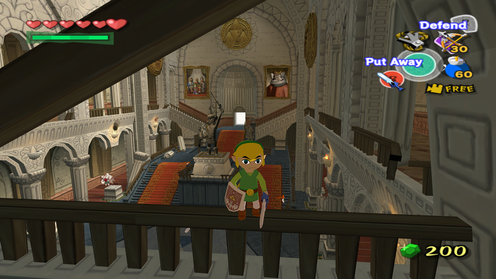
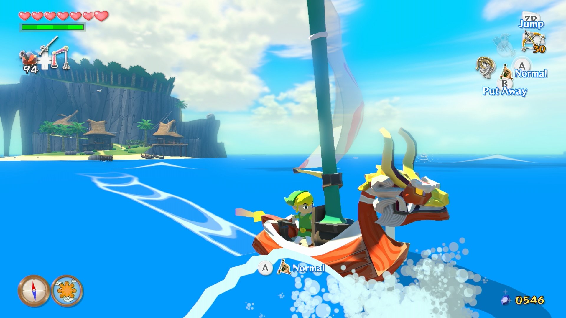
The eighth entry of the critically-acclaimed Legend of Zelda franchise, Wind Waker is most famous for it's unique 'toon' cel-shaded style. With its use of vibrant colours, hard shading and stylised effects, the game often appears more like an interactive cartoon than a video-game. It also makes use of fully real-time lighting and effects like depth of field blur to further this effect.


Naturally, the characters that inhabit this vibrant world are all suitably cartoonish, and this extends to the game's protagonist, Link; the appearance of Wind Waker's hero is far removed from that of previous installments, with his enlarged head and stumpy legs. And yet, despite his drastically different physiology, he still retains the same general look of his predecessors, including the green clothes, the floppy hat and the signature sword and shield. Furthermore, the toonish style allows Link to be far more expressive than ever before; as players explore, Link will glance around the room, and his expression will noticibly change depending on the situation.


Wind Waker has recently been rereleased on the Wii U, with smoother textures and bloom lighting

How did the Fans react?
From it's initial announcement to release, Wind Waker recieved a great deal of hatred from fans of the series. The cause of this hate was that most fans had been hoping for a more mature, realistic styled game (a desire fuelled largely by the 2000 Spaceworld Zelda demo that hinted at such a game), and viewed Wind Waker's cel-shaded aesthetic as 'childish', leading to many of them dismissing the game out of hand.


In the decade that has passed since them, however, opinions of Wind Waker's style have become much more favourable, especially with the release of Wind Waker HD. Part of this may be because of a rise of stylised games, such as Team Fortress 2, which has cause many to abandon the mistake belief that realistic graphics are inherently better and more 'mature'. People who dislike it still remain, but they are far fewer in number than they were before and most of them have turned their attentions to newer iterations

Personal Verdict
Wind Waker stands as one of my favourite games of all time, and the cel-shaded aesthetic is one of the reasons why. The fact is, it's a a charmingly beautiful game full of vibrant characters and it is a joy simply to watch. The highlight, of course, is Link himself, who is different yet so familiar at the same time. Truth be told, the game is more of a stylistic change than a full redesign, but with results like this it doesn't really matter.

Thursday, 17 October 2013

Style Case Study #7: Okami

Style Case Study #7: Okami
Genre: Action-Adventure
Developer: Clover Studios
Publisher: Capcom
Platform: PlayStation 2, Wii, PlayStation 3 (PSN only)
Release Date: 20 April 2006

Normally I'd just leave it at the 6 case studies I've done already, but I couldn't really talk about aesthetics without mentioning this gem...
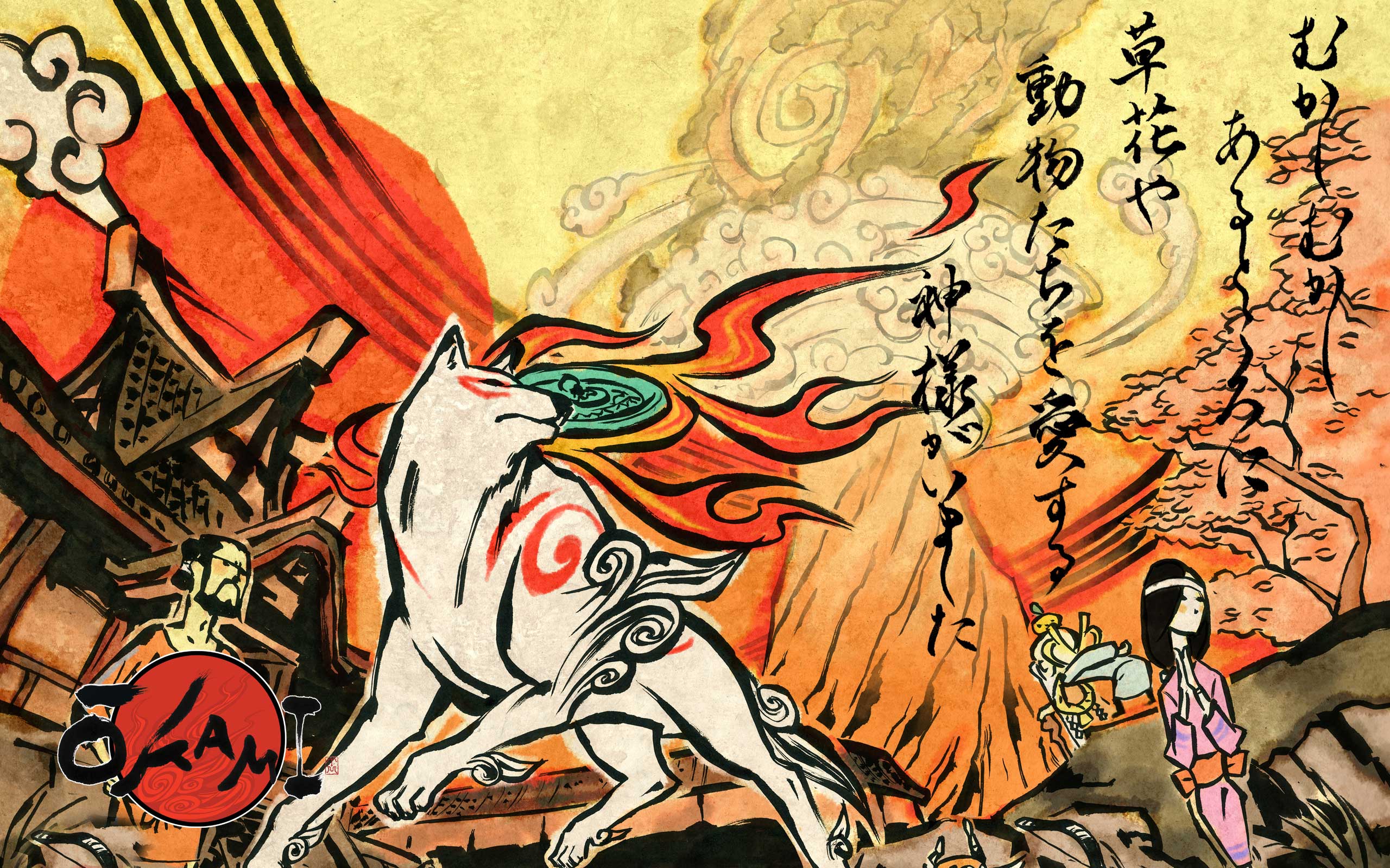
Okami is often regarded as the PS2's swansong. It is a charmingly well crafted adventure based on Shinto mythology released at the end of the console's lifetime. It was critically acclaimed, yet sadly did not sell nearly as well as it should have (though it has since been rereleased twice and had a sequel). That said, the game certainly stands out, mostly thanks to its unique art style.
Image Source: http://img.gawkerassets.com/img/17qthmh0rm3m5jpg/original.jpg

Based on Japanese sum-e ink wash painting, Okami mixes broad brush stroke-like outlines with cel-shading to make it look as if the characters and world have all leaped out of an old Japanese painting, something that perfectly compliments the Shinto-based storyline. The same can be said of the characters; each one appears hand-drawn, even as they move around the 3D environment.

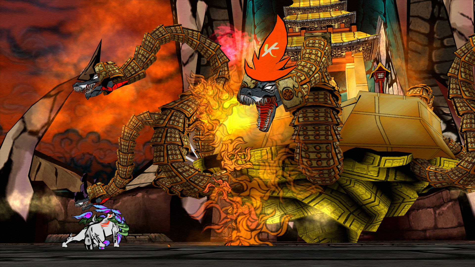
Most characters are designed to be simple, but with a recognisable silhouette, while many who are based on figures and creatures from Shinto mythology have a great deal of symbolism integrated into their design. The protagonist, Amaterasu, appears as a white wolf with red markings, giving her a fierce yet majestic appearance, with the flaming disk on her back reflecting her role as a the sun goddess. The first major villain, Orochi, is described in legend as a many-headed snake the size of a mountain, so here he appears with eight heads emerging from a fortress-like body. Even the final boss, Yami, has symbolism associated throughout his many forms including:-

  • His true form shows that even small and innocent things can become evil and that all great evil starts out small.
  • His first form, which is a sphere with red markings, shows humans' desire to destroy things. He demonstrates this using Hammers, Buzzsaws and missiles during his battle with Amaterasu.
  • His second form, which is a sphere with green markings, shows how humans like to incinerate things.
  • His third form, which is a slot machine with blue markings, shows how humans are always taking risks.
  • His fourth form, which resembles a yellow two-legged walker with whips for arms shows humans' desire to use Technology for their evil needs.
  • His fifth and final form, which resembles a black sphere with a red hand, shows how humans use their hands for evil.
These are just a few examples, but Okami's 30 hour long adventure features many more like them.


So now for the Verdict; did Okami's art style result in better character design?
Yes

Right, enough case studies! Next post should have some practical stuff

Wednesday, 16 October 2013

Style Case Study #6: Dead Space

Style Case Study #6: Dead Space
Genre: Survival Horror, Action
Developer: Visceral Games
Publisher: Electronic Arts
Platform: PC, PlayStation 3, Xbox 360
Engine: Godfather Engine, Havok
Release Date: October 14, 2008

Dead Space is a relatively recent addition to the survival horror genre, yet it has already made a strong impression on the industry at large. Granted, this is partly due to some questionable decisions made by it's publisher (really EA? Micro-transactions in a horror game? For shame...). However, at the same time, the series has been lauded for it's visual design and aesthetics, which are inspired by classic horror films such as Alien and Event Horizon.

Of course, the character design is fairly strong in its own right, particularly in how it seamlessly integrates with the gameplay. Let's take a look at the main protagonist, Isaac Clarke; the game's UI is literally incorporated into his design, with his RIG (the glowing thing on his spine) representing his health bar and various holographic projections  being used for menus, ammo etc. If nothing else, it's a clever way of integrating the UI into the general gameplay.

Even without this, however, the various suits that Isaac wears are well designed in their own right. Each one not only looks like something a futuristic engineer (or in some cases, soldier) would wear, but are also practical and ergonomic in their design. Some of them, such as Dead Space 2's Advanced Suit, even managed to look good while defying the 'less is more' rule, which is somewhat impressive. Further more, the various helmets and visors that Isaac wears are each pretty distinctive, with some being almost iconic.

The game's enemies, the Necromorphs, are also disgustingly well designed; their gory, distorted bodies and primal movements are gruesomely alien, while at the same time disturbingly human, resulting in an odd variety of the uncanny valley, which considering that they're enemies in a horror game works well (such as pity the gameplay doesn't make them that scary...). Naturally, the whole game is rendered realistically, and many of the characters' faces are modelled after their voice actors, so no artistic style is used.

So now for the Verdict; did Dead Space's art style result in better character design?
No

Tuesday, 15 October 2013

Style Case Study #5: Swords & Sorcery

Style Case Study #5: Superbrothers - Swords & Sworcery EP
Genre: Art game, Action-Adventure
Developer: Capybara Games, Superbrothers
Publisher: Capybara Games
Platform: iOS, Microsoft Windows (Steam), Mac OS X, Linux, Android
Release Date: March 24, 2011(iPad), April 27, 2011(iPhone), April 16, 2012 (Steam), May 31, 2012 (Mac, GNU/Linux), November 2012 (Android)
Swords and Sworcery is an indie game released fairly recently that abandons 3D in favour of 2D pixel art. The pixelated characters are all designed  along the mantra of 'less is more'; they are given enough to detail to make them recognisable and distinctive, but little enough to leave something to the imagination. There's even a bit of the artist's flair present within the visual design, which helps distinguish the game from other 'retro' style games.

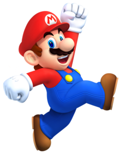
While we're on the subject, the limitations of 8-bit graphics actually played a major role in the design of Nintendo's Super Mario. Due to the graphical limitations of arcade hardware at the time, Mario's creator Shigeru Miyamoto clothed the character in red overalls and a blue shirt to contrast against each other and the background. A red cap was added to let Miyamoto avoid drawing the character's hairstyle, forehead, and eyebrows, as well as to circumvent the issue of animating his hair as he jumped. The result? One of gaming's long-standing icons.

So now for the Verdict; did Swords & Sworcery's art style result in better character design?
Yes

Sources

  • Mike Snider (Nov 08, 2010). "Q&A: 'Mario' creator Shigeru Miyamoto". USA Today. Retrieved 15/10/2013

Monday, 14 October 2013

Style Case Study #4: Ninja Theory

Style Case Study #4: Ninja Theory
Originally known as Just Add Monsters
Founded: March 2000
Key People: Mike Ball (chief technology), Nina Kristensen (chief development), Tameemi Antoniades (chief design), Jez San
Titles: Kung Fu Chaos (2003), Heavenly Sword (2007), Enslaved: Odyssey to the West (2010), DMC: Devil May Cry (2013)
Image Source: http://upload.wikimedia.org/wikipedia/en/9/9f/Nintheo.png

There were so many examples I could use for Ninja Theory games, that it seemed best to just throw them all together in one case study. Anyway, let's crack on....

Ninja Theory are a Game Developer studio that specialise in storytelling, level design and visual design. Though they have only developed a few games, each one is visually stunning, with vibrant, breathtaking environments that capture the imagination, be they ancient Eastern battlegrounds, post-apocalyptic cities or even paranormal dimensions.

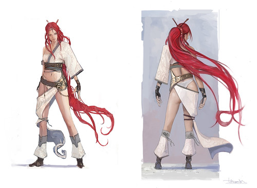
The same can also be said of their characters. Each one, from Heavenly Sword's Nariko to the various mechs in Enslaved, is easily identifiable at a glance and as vibrantly coloured as the environments. It's fair to say that whoever does their character designs knows what he's doing (though some would violently disagree in regards to DMC, but that's another matter altogether...)

However, while the concept art does have a certain style to it, the company has rendered each of their games realistically, and has used motion-capture for the majority of their cutscenes. As such, no particular visual or artistic style has been used in their games to date (though a graphic-novel style is used in some extra material for Heavenly Sword).

So now for the Verdict; does the art style in Ninja Theory's games result in better character design?
No

Style Case Study #3: Dishonored

Style Case Study #3: Dishonored
Genre: Action-Adventure, Stealth
Developer: Arkane Studios
Publisher: Bethesda Softworks
Platform: PC, PlayStation 3, Xbox 360
Engine: Unreal Engine 3
Release Date: October 9, 2012
Image Source: http://www.ps3hungary.hu/e107_images/newspost_images/2011/dishonored1.jpg

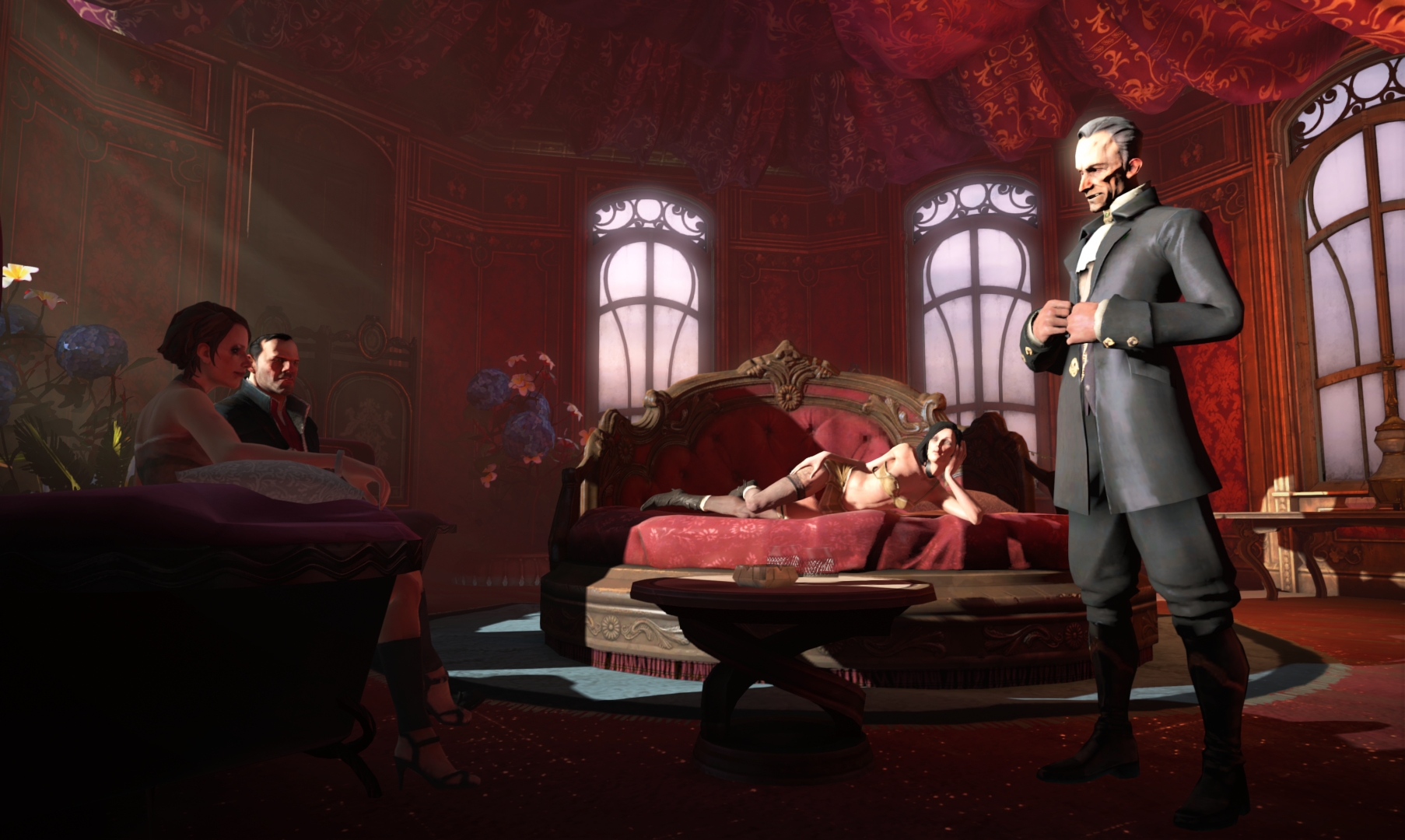
Released in late 2012 to near universal critical acclaim, Dishonored was something of a welcome surprise for many gamers at the time of its release. Featuring a surreal, steampunk world akin to Victorian London and gameplay that allowed players to not only choose how to proceed but also how the story progressed, it was an interesting new intellectual property for gamers to sink their teeth into.


However, the most striking thing about Dishonoured is it's art style; while it is rendered realistically, the visual design has a painting-like quality, with characters being designed with slightly exaggerated features and proportions. This gives the game a distinct look that compliments the grim, distorted steampunk setting it takes place in.
Image Source: http://img.gawkerassets.com/img/18327bj08sx1vjpg/original.jpg
Image Source: http://www.creativeuncut.com/gallery-23/art/dh-character-concepts.jpg

So now for the Verdict; did Dishonored's art style result in better character design?
Yes

Style Case Study #2: Guild Wars

Style Case Study #2: Guild Wars
Genre: MMORPG
Developer: ArenaNet
Publisher: NCsoft
Platform: PC
Engine: Guild Wars engine
Release Date: April 26, 2005
Image Source: http://bestgamewallpapers.com/files/guild-wars-eye-of-the-north/charr-concept-art.jpg

One of several MMOs available today, the Guild Wars franchise is probably best known for it's stunning concept artwork. One need only use a quick Google image search to find hundreds of images depicting beautiful environments and landscapes, imaginative characters and enemies and other things from the series. The majority of these concepts have been translated faithfully into the games themselves, which currently span 3 interconnected campaigns, an expansion pack and a recently released sequel.

Set across 3 fictional continents, including the fantasy-esque Tyria, the oriental Kantha and the savannah-like Elona, the games feature 12 playable professions, each possessing a selection of great-looking unique armour sets, as well as a plethora of non-playable characters and enemies that each fit seamlessly into the world they appear in. In addition to this, while most fantasy MMOs tend to base their races after those in Tolkien's Middle earth, Guild Wars features it's own unique races, including the hardy, Viking-like Norn, the warlike, industrial lion-like Charr and the impish, yet genius Asura.

As far as style goes, however, ArenaNet have chosen to present their fantasy world as photorealistic. However, this has done little to diminish the beauty of Guild Wars' design, which has been strong enough to withstand the test of time, with the sequel having upgrading the graphical quality even further.

So now for the Verdict; did Guild Wars' art style result in better character design?
No

Thursday, 10 October 2013

Style Case Study #1: Team Fortress 2

Style Case Study #1: Team Fortress 2
Genre: FPS, Multiplayer
Developer: Valve Corporation
Platform: Windows, Xbox 360, PlayStation 3, OS X, Linux
Engine: Source
Release Date: October 9, 2007

The sequel to a 1996 Half-Life mod, Team Fortress 2 spent the early days of it's 10-year development cycle resembling other military shooters at the time, such as Counter-Strike. Screenshots of the earliest builds of the game reveal a very typical photorealistic aesthetic, resulting in a very bland, uninteresting look that did little to differentiate itself from its competitors. It was also hard to tell the different characters apart as they all looked the same.

Image Source: http://media.bestofmicro.com/A-screenshot-of-the-early-design-shows-a-similar-look-to-Counter-Strike,0-M-94630-13.jpg

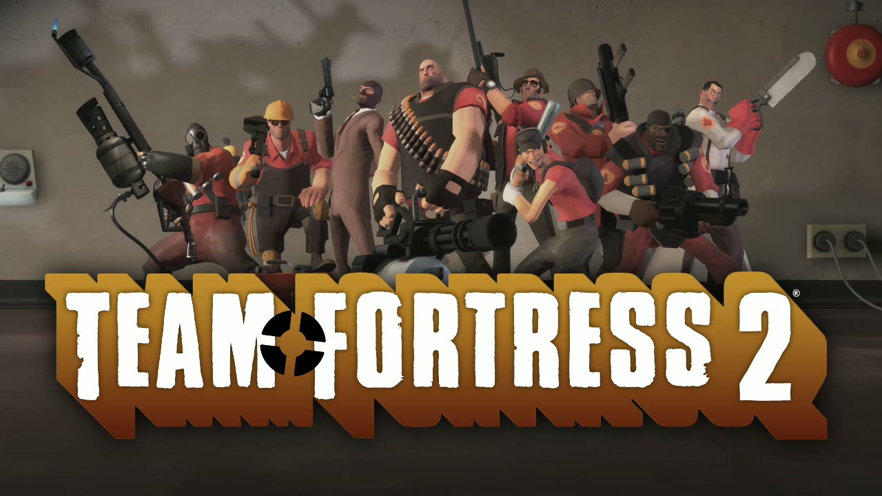
However, it seems that Valve realised this and, following a long period of experimentation that resulted in a string of delays, they revealed a completely different art direction for the game in 2006, which we see in the Team Fortress 2 we know and love today. Inspired by the art of J. C. Leyendecker, Dean Cornwell and Norman Rockwell, the game utilises a cartoonish style with a colourful yet limited colour pallete, and throuh this they have managed to create 9 distinct, unique character classes that are easily identifiable at first glance and each brimming with personality.

Image Source: http://randomaniac.us/wp-content/uploads/2011/09/tf29.jpg

So now for the Verdict; did Team Fortress 2's art style result in better character design?
Yes

Sources

  • J. Mitchell, M. Francke, & D. Eng (2007). Illustrative Rendering in Team Fortress 2. Valve Corporation.
  • Valve Corporation (2008). Stylization with a Purpose - The Illustrative World of Team Fortress 2. San Fransisco, Game Developers Conference 2008.