Genre: Action-Adventure
Developer: Clover Studios
Publisher: Capcom
Platform: PlayStation 2, Wii, PlayStation 3 (PSN only)
Release Date: 20 April 2006
Normally I'd just leave it at the 6 case studies I've done already, but I couldn't really talk about aesthetics without mentioning this gem...
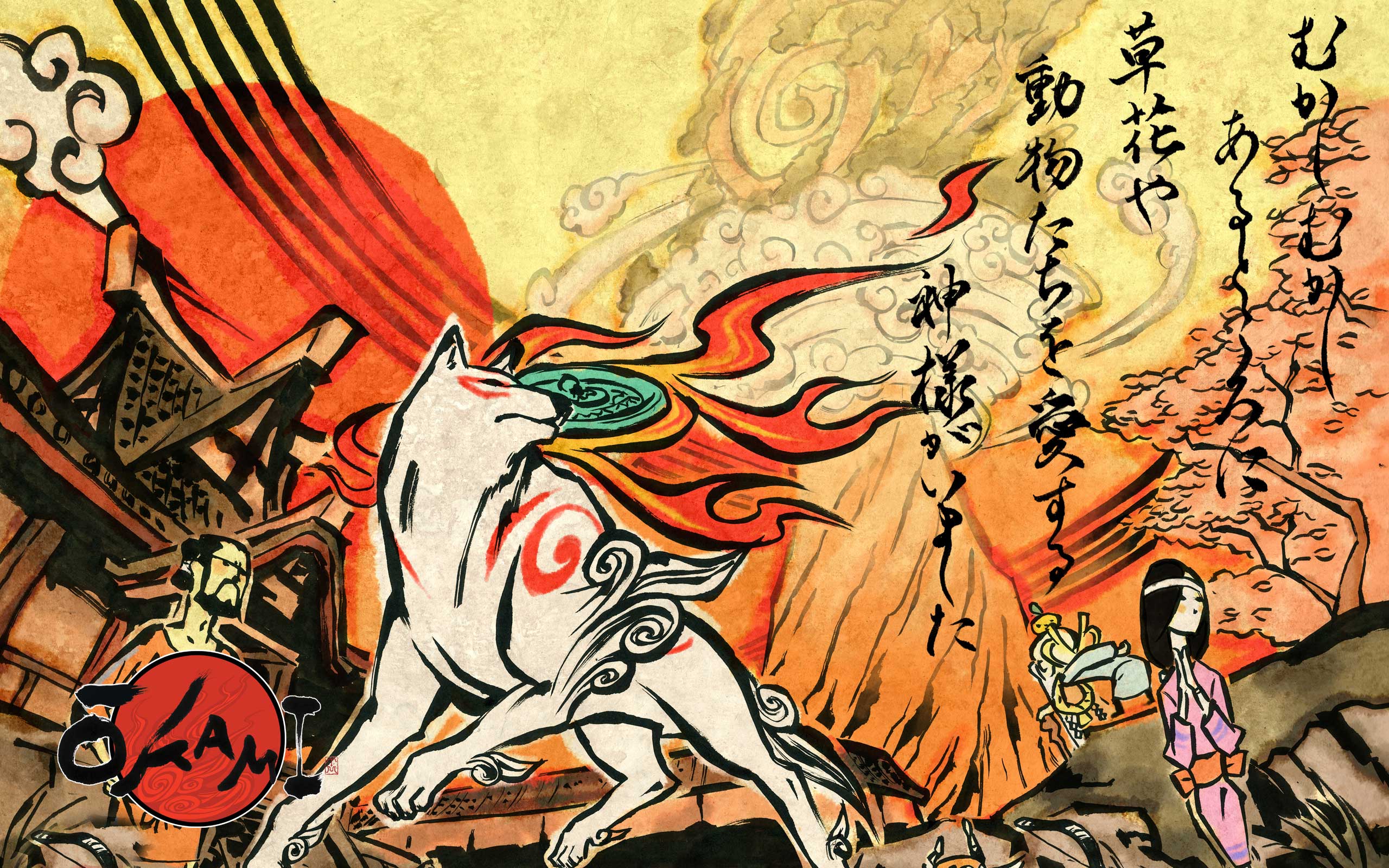
Okami is often regarded as the PS2's swansong. It is a charmingly well crafted adventure based on Shinto mythology released at the end of the console's lifetime. It was critically acclaimed, yet sadly did not sell nearly as well as it should have (though it has since been rereleased twice and had a sequel). That said, the game certainly stands out, mostly thanks to its unique art style.

Image Source: http://img.gawkerassets.com/img/17qthmh0rm3m5jpg/original.jpg
Based on Japanese sum-e ink wash painting, Okami mixes broad brush stroke-like outlines with cel-shading to make it look as if the characters and world have all leaped out of an old Japanese painting, something that perfectly compliments the Shinto-based storyline. The same can be said of the characters; each one appears hand-drawn, even as they move around the 3D environment.
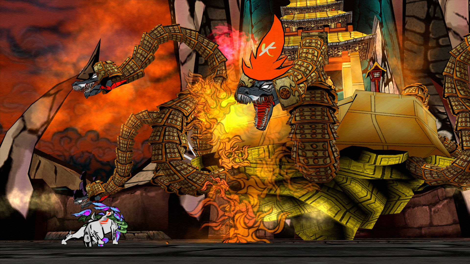
Image Source: http://images3.wikia.nocookie.net/__cb20130507134817/capcomdatabase/images/2/2e/Okami_HD_Screenshot.png
- His true form shows that even small and innocent things can become evil and that all great evil starts out small.
- His first form, which is a sphere with red markings, shows humans' desire to destroy things. He demonstrates this using Hammers, Buzzsaws and missiles during his battle with Amaterasu.
- His second form, which is a sphere with green markings, shows how humans like to incinerate things.
- His third form, which is a slot machine with blue markings, shows how humans are always taking risks.
- His fourth form, which resembles a yellow two-legged walker with whips for arms shows humans' desire to use Technology for their evil needs.
- His fifth and final form, which resembles a black sphere with a red hand, shows how humans use their hands for evil.

Image Source: http://i1.ytimg.com/vi/4Xd2zC9J95s/maxresdefault.jpg
These are just a few examples, but Okami's 30 hour long adventure features many more like them.
So now for the Verdict; did Okami's art style result in better character design?
Yes
Right, enough case studies! Next post should have some practical stuff
No comments:
Post a Comment