Monday 28 October 2013

Style Practical: Character Thumbnails

Ok, so I've managed to create some thumbnails for the two characters I detailed in that brief. So... here they are

Thumbnails for the Barbarian. For these, I focused more on his anatomy and proportions, as he is intended to be the stylised character

Thumbnails for the Engineer. In contrast to the Barbarian, these thumbnails focused on the general shape of what he's wearing

Yeah, this post isn't as text-heavy as the others. If anyone reading this has any feedback, feel free to share it. Otherwise, I'll be getting on with the development of these.

Tuesday 22 October 2013

Style Practical Brief

Josh suggested I write up a quick brief for the practical investigation before I start, so here's what I've come up with:

Style Practical Brief
Design two visually distinct characters to test Style Hypothesis

Character 1

  • Must be presented in a semi-realistic style (exaggerated proportions, emphasis on shape etc.)
  • Human
  • Fantasy setting - something Swords and Sorcery-esque, like Conan the Barbarian
  • Burly Barbarian/ Warrior
  • Must have a massive weapon (sword/axe)
  • Rear view must be as interesting as front

Character 2

  • Must be presented in a realistic style
  • Human
  • Futuristic/ Sci-Fi setting - early Space Age
  • Mechanic/ engineer
  • Must be equipped for zero gravity/ vacuum
  • Rear view must be as interesting as front

And that's about the sum of it. You should see some of the work towards this over the next couple of days

Thursday 17 October 2013

Style Case Study #7: Okami

Style Case Study #7: Okami
Genre: Action-Adventure
Developer: Clover Studios
Publisher: Capcom
Platform: PlayStation 2, Wii, PlayStation 3 (PSN only)
Release Date: 20 April 2006

Normally I'd just leave it at the 6 case studies I've done already, but I couldn't really talk about aesthetics without mentioning this gem...
Okami is often regarded as the PS2's swansong. It is a charmingly well crafted adventure based on Shinto mythology released at the end of the console's lifetime. It was critically acclaimed, yet sadly did not sell nearly as well as it should have (though it has since been rereleased twice and had a sequel). That said, the game certainly stands out, mostly thanks to its unique art style.
Image Source: http://img.gawkerassets.com/img/17qthmh0rm3m5jpg/original.jpg

Based on Japanese sum-e ink wash painting, Okami mixes broad brush stroke-like outlines with cel-shading to make it look as if the characters and world have all leaped out of an old Japanese painting, something that perfectly compliments the Shinto-based storyline. The same can be said of the characters; each one appears hand-drawn, even as they move around the 3D environment.

Most characters are designed to be simple, but with a recognisable silhouette, while many who are based on figures and creatures from Shinto mythology have a great deal of symbolism integrated into their design. The protagonist, Amaterasu, appears as a white wolf with red markings, giving her a fierce yet majestic appearance, with the flaming disk on her back reflecting her role as a the sun goddess. The first major villain, Orochi, is described in legend as a many-headed snake the size of a mountain, so here he appears with eight heads emerging from a fortress-like body. Even the final boss, Yami, has symbolism associated throughout his many forms including:-

  • His true form shows that even small and innocent things can become evil and that all great evil starts out small.
  • His first form, which is a sphere with red markings, shows humans' desire to destroy things. He demonstrates this using Hammers, Buzzsaws and missiles during his battle with Amaterasu.
  • His second form, which is a sphere with green markings, shows how humans like to incinerate things.
  • His third form, which is a slot machine with blue markings, shows how humans are always taking risks.
  • His fourth form, which resembles a yellow two-legged walker with whips for arms shows humans' desire to use Technology for their evil needs.
  • His fifth and final form, which resembles a black sphere with a red hand, shows how humans use their hands for evil.
These are just a few examples, but Okami's 30 hour long adventure features many more like them.


So now for the Verdict; did Okami's art style result in better character design?
Yes

Right, enough case studies! Next post should have some practical stuff

Wednesday 16 October 2013

Style Case Study #6: Dead Space

Style Case Study #6: Dead Space
Genre: Survival Horror, Action
Developer: Visceral Games
Publisher: Electronic Arts
Platform: PC, PlayStation 3, Xbox 360
Engine: Godfather Engine, Havok
Release Date: October 14, 2008

Dead Space is a relatively recent addition to the survival horror genre, yet it has already made a strong impression on the industry at large. Granted, this is partly due to some questionable decisions made by it's publisher (really EA? Micro-transactions in a horror game? For shame...). However, at the same time, the series has been lauded for it's visual design and aesthetics, which are inspired by classic horror films such as Alien and Event Horizon.

Of course, the character design is fairly strong in its own right, particularly in how it seamlessly integrates with the gameplay. Let's take a look at the main protagonist, Isaac Clarke; the game's UI is literally incorporated into his design, with his RIG (the glowing thing on his spine) representing his health bar and various holographic projections  being used for menus, ammo etc. If nothing else, it's a clever way of integrating the UI into the general gameplay.

Even without this, however, the various suits that Isaac wears are well designed in their own right. Each one not only looks like something a futuristic engineer (or in some cases, soldier) would wear, but are also practical and ergonomic in their design. Some of them, such as Dead Space 2's Advanced Suit, even managed to look good while defying the 'less is more' rule, which is somewhat impressive. Further more, the various helmets and visors that Isaac wears are each pretty distinctive, with some being almost iconic.

The game's enemies, the Necromorphs, are also disgustingly well designed; their gory, distorted bodies and primal movements are gruesomely alien, while at the same time disturbingly human, resulting in an odd variety of the uncanny valley, which considering that they're enemies in a horror game works well (such as pity the gameplay doesn't make them that scary...). Naturally, the whole game is rendered realistically, and many of the characters' faces are modelled after their voice actors, so no artistic style is used.

So now for the Verdict; did Dead Space's art style result in better character design?
No

Tuesday 15 October 2013

Style Case Study #5: Swords & Sorcery

Style Case Study #5: Superbrothers - Swords & Sworcery EP
Genre: Art game, Action-Adventure
Developer: Capybara Games, Superbrothers
Publisher: Capybara Games
Platform: iOS, Microsoft Windows (Steam), Mac OS X, Linux, Android
Release Date: March 24, 2011(iPad), April 27, 2011(iPhone), April 16, 2012 (Steam), May 31, 2012 (Mac, GNU/Linux), November 2012 (Android)
Swords and Sworcery is an indie game released fairly recently that abandons 3D in favour of 2D pixel art. The pixelated characters are all designed  along the mantra of 'less is more'; they are given enough to detail to make them recognisable and distinctive, but little enough to leave something to the imagination. There's even a bit of the artist's flair present within the visual design, which helps distinguish the game from other 'retro' style games.

While we're on the subject, the limitations of 8-bit graphics actually played a major role in the design of Nintendo's Super Mario. Due to the graphical limitations of arcade hardware at the time, Mario's creator Shigeru Miyamoto clothed the character in red overalls and a blue shirt to contrast against each other and the background. A red cap was added to let Miyamoto avoid drawing the character's hairstyle, forehead, and eyebrows, as well as to circumvent the issue of animating his hair as he jumped. The result? One of gaming's long-standing icons.

So now for the Verdict; did Swords & Sworcery's art style result in better character design?
Yes

Sources

  • Mike Snider (Nov 08, 2010). "Q&A: 'Mario' creator Shigeru Miyamoto". USA Today. Retrieved 15/10/2013

Monday 14 October 2013

Style Case Study #4: Ninja Theory

Style Case Study #4: Ninja Theory
Originally known as Just Add Monsters
Founded: March 2000
Key People: Mike Ball (chief technology), Nina Kristensen (chief development), Tameemi Antoniades (chief design), Jez San
Titles: Kung Fu Chaos (2003), Heavenly Sword (2007), Enslaved: Odyssey to the West (2010), DMC: Devil May Cry (2013)
Image Source: http://upload.wikimedia.org/wikipedia/en/9/9f/Nintheo.png

There were so many examples I could use for Ninja Theory games, that it seemed best to just throw them all together in one case study. Anyway, let's crack on....

Ninja Theory are a Game Developer studio that specialise in storytelling, level design and visual design. Though they have only developed a few games, each one is visually stunning, with vibrant, breathtaking environments that capture the imagination, be they ancient Eastern battlegrounds, post-apocalyptic cities or even paranormal dimensions.

The same can also be said of their characters. Each one, from Heavenly Sword's Nariko to the various mechs in Enslaved, is easily identifiable at a glance and as vibrantly coloured as the environments. It's fair to say that whoever does their character designs knows what he's doing (though some would violently disagree in regards to DMC, but that's another matter altogether...)

However, while the concept art does have a certain style to it, the company has rendered each of their games realistically, and has used motion-capture for the majority of their cutscenes. As such, no particular visual or artistic style has been used in their games to date (though a graphic-novel style is used in some extra material for Heavenly Sword).

So now for the Verdict; does the art style in Ninja Theory's games result in better character design?
No

Style Case Study #3: Dishonored

Style Case Study #3: Dishonored
Genre: Action-Adventure, Stealth
Developer: Arkane Studios
Publisher: Bethesda Softworks
Platform: PC, PlayStation 3, Xbox 360
Engine: Unreal Engine 3
Release Date: October 9, 2012
Image Source: http://www.ps3hungary.hu/e107_images/newspost_images/2011/dishonored1.jpg

Released in late 2012 to near universal critical acclaim, Dishonored was something of a welcome surprise for many gamers at the time of its release. Featuring a surreal, steampunk world akin to Victorian London and gameplay that allowed players to not only choose how to proceed but also how the story progressed, it was an interesting new intellectual property for gamers to sink their teeth into.


However, the most striking thing about Dishonoured is it's art style; while it is rendered realistically, the visual design has a painting-like quality, with characters being designed with slightly exaggerated features and proportions. This gives the game a distinct look that compliments the grim, distorted steampunk setting it takes place in.
Image Source: http://img.gawkerassets.com/img/18327bj08sx1vjpg/original.jpg
Image Source: http://www.creativeuncut.com/gallery-23/art/dh-character-concepts.jpg

So now for the Verdict; did Dishonored's art style result in better character design?
Yes

Style Case Study #2: Guild Wars

Style Case Study #2: Guild Wars
Genre: MMORPG
Developer: ArenaNet
Publisher: NCsoft
Platform: PC
Engine: Guild Wars engine
Release Date: April 26, 2005
Image Source: http://bestgamewallpapers.com/files/guild-wars-eye-of-the-north/charr-concept-art.jpg

One of several MMOs available today, the Guild Wars franchise is probably best known for it's stunning concept artwork. One need only use a quick Google image search to find hundreds of images depicting beautiful environments and landscapes, imaginative characters and enemies and other things from the series. The majority of these concepts have been translated faithfully into the games themselves, which currently span 3 interconnected campaigns, an expansion pack and a recently released sequel.

Set across 3 fictional continents, including the fantasy-esque Tyria, the oriental Kantha and the savannah-like Elona, the games feature 12 playable professions, each possessing a selection of great-looking unique armour sets, as well as a plethora of non-playable characters and enemies that each fit seamlessly into the world they appear in. In addition to this, while most fantasy MMOs tend to base their races after those in Tolkien's Middle earth, Guild Wars features it's own unique races, including the hardy, Viking-like Norn, the warlike, industrial lion-like Charr and the impish, yet genius Asura.

As far as style goes, however, ArenaNet have chosen to present their fantasy world as photorealistic. However, this has done little to diminish the beauty of Guild Wars' design, which has been strong enough to withstand the test of time, with the sequel having upgrading the graphical quality even further.

So now for the Verdict; did Guild Wars' art style result in better character design?
No

Thursday 10 October 2013

Style Case Study #1: Team Fortress 2

Style Case Study #1: Team Fortress 2
Genre: FPS, Multiplayer
Developer: Valve Corporation
Platform: Windows, Xbox 360, PlayStation 3, OS X, Linux
Engine: Source
Release Date: October 9, 2007

The sequel to a 1996 Half-Life mod, Team Fortress 2 spent the early days of it's 10-year development cycle resembling other military shooters at the time, such as Counter-Strike. Screenshots of the earliest builds of the game reveal a very typical photorealistic aesthetic, resulting in a very bland, uninteresting look that did little to differentiate itself from its competitors. It was also hard to tell the different characters apart as they all looked the same.

Image Source: http://media.bestofmicro.com/A-screenshot-of-the-early-design-shows-a-similar-look-to-Counter-Strike,0-M-94630-13.jpg

However, it seems that Valve realised this and, following a long period of experimentation that resulted in a string of delays, they revealed a completely different art direction for the game in 2006, which we see in the Team Fortress 2 we know and love today. Inspired by the art of J. C. Leyendecker, Dean Cornwell and Norman Rockwell, the game utilises a cartoonish style with a colourful yet limited colour pallete, and throuh this they have managed to create 9 distinct, unique character classes that are easily identifiable at first glance and each brimming with personality.

Image Source: http://randomaniac.us/wp-content/uploads/2011/09/tf29.jpg

So now for the Verdict; did Team Fortress 2's art style result in better character design?
Yes

Sources

  • J. Mitchell, M. Francke, & D. Eng (2007). Illustrative Rendering in Team Fortress 2. Valve Corporation.
  • Valve Corporation (2008). Stylization with a Purpose - The Illustrative World of Team Fortress 2. San Fransisco, Game Developers Conference 2008.

Tuesday 8 October 2013

Hypothesis #1: The Impact of Style

(Right, before I start this post, I'm just going to quickly run through how I intend to work through these 'investigations'; I'll begin with a Hypothesis e.g. X leads to Y, then look at some case studies e.g. examples of games that support the assumption, examples that don't etc. From there, I'll do a practical experiment to test the assumption and then finish with a conclusion that discusses whether or not the theory was correct. May refine this process later, but it'll do for now. Now let's crack on!)

Assumption:
An interesting Aesthetic design leads to fundamentally better Character Design


I'll be honest, I'm not a big fan of photo-realistic games. I mean, sure, they do look great sometimes, but they often run the risk of diving headfirst into the uncanny valley and they have a bad habit of ageing terribly after only a short period of time. Conversely, more stylistic games are usually much easier on the eye and will often remain visually impressive many years after their release.
 This has led me to believe that a game's aesthetic style may have a much greater impact on character design than previously thought. But is this the case?

 ...Well, there's only one way to find out, isn't there? It's research time!

Sunday 6 October 2013

The Pillars of Good Character Design

Right, so my last couple of posts covered what games I considered to have good/ bad designs, but that doesn't really say much about what made those designs good/ bad. So, let's take a quick look at the pillars of good character design.

Now, I'm aware that it seems a little counter-intuitive and anti-climactic to just do a post explaining what makes good character design when I'm investigating it for my Masters, BUT this stuff doesn't cover EVERYTHING, so there may be some missing link here that I can look into. Anyway, without further ado:-

Image Source: http://rant.computator.ca/wp-content/post-uploads/2008/11/popular-silhouettes.jpg

1. An Easily Recognisable Silhouette
You can always recognise a good character design based solely on the shape of their silhouette, which is usually why most concept artists begin by creating a basic silhouette. The idea is that the character should not only stand out but also be identifiable from their outline alone, be it because of their anatomy, clothing or even their posture. Think about it; you can always pick out the likes of Bugs Bunny or Sonic the Hedgehog from a line-up. Granted, this can be a little harder with characters of more realistic proportions, but there will always be something that gives them away (for example, Solid Snake's bandana)

2. Limited Colour Palette
Most good character designs primarily use around 2-3 colours in their palette. Mario = Red & Blue. Master Chief = Green, Gold & Black. Assassin's Creed = White, Brown & Red/ Blue. This doesn't mean you can't use other colours though; you're free to use various different shades of the colours you've got and other colours can be used for skin and minor details, but don't overuse them. Rainbow-coloured characters rarely look good (but when they do, they're fabulous)

3. Context
Who is the character? Where do they come from? What actions do they perform? A good character design should reflect these things. If they are a soldier, they should look like a soldier. If they're stealthy, they should be able to blend in with their surroundings. The same also applies to the game's tone; a grim and gritty character won't fit into a wacky, cartoonish setting (unless they're a parody, but that's another matter altogether). Always keep these things in mind when designing characters.

4. But does it Function?
Functionality is a key factor in character design, one that should come before anything else. There's nothing more distracting that something that looks like it won't work properly. After all, it doesn't matter how cool your weapon look if it doesn't actually work as a weapon. This is the main reason why chainmail bikinis and other types of female 'armour' are considered to be bad design; sure, they may add sex appeal, but they're absolutely useless at protecting the wearer from harm, which is what it's for. Basically, aim to make the design as practical as possible within the world it appears in.

5. Less is More
And here's the part that Square-Enix always gets wrong: don't make a character too complex. Walking clusterfucks are not good designs, so it's often best to aim for simplicity when designing a character. Accessories are okay in moderation, but it's always best to wait until you've nailed down the basic look before adding them

6. Originality
Yeah, bit of a no-brainer, but a good character has to be unique. Which means they can't look like someone else's character. In other words, no ripping off other game characters, because that's terrible

Sooo, yeah, that about covers all the unanimous aspects of good design. But is there something else? Is there some unknown aspect hiding in plain sight? Well, that's what I intend to find out (for now), so from here on out, I'll be investigating things to see their impact on character design.
First up: Aesthetic design/ Style

Tuesday 1 October 2013

How NOT to design a Character...

Ok, since the last post was full of examples of good character designs, let's follow that up with a few really bad examples!
Once again, these are only a few examples in no particular order and these are based on my own opinion, so feel free to disagree (though somehow I doubt you will)

1. Final Fantasy
To be honest, there are hundreds of Japanese games I could name that have some truly awful character designs, but Final Fantasy really takes the cake. Sure, the cast of earlier games are pretty good and there are SOME good designs in there (mostly enemies), you'd be hard pressed to find a major character in the recent games who doesn't have ridiculous hair, illogical clothing and more useless accessories than Mr T. If anything, their overly cluttered designs provide a excellent case for why less is more...

Image Source: http://ffalthalus.files.wordpress.com/2011/12/yrp_1.jpg


2. Gears of War
I'm probably baiting a particularly angry bear with this one, but I really hate the characters from Gears of War. The entirety of their designs all seem to begin with 'bulky' and end with 'muscle', with very little in between. Even their armour makes them seem like a comically oversized walls of meat. Just... urgh, they look so stupid...
Image Source: http://raynfall.files.wordpress.com/2011/08/gowtroops.jpg

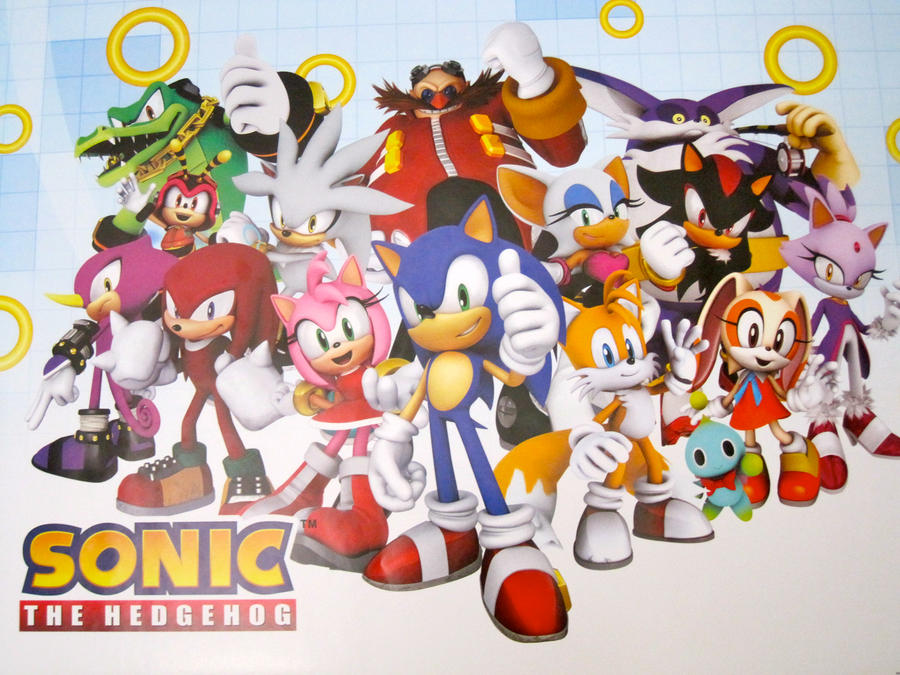
3. Sonic the Hedgehog 
The Sonic franchise is one of the rare examples of bad character design where it wasn't always bad. Before the jump to 3D, he was actually one of the biggest icons in gaming, with a simple memorable design. But then, come Sonic Adventure, SEGA decided to 'update' the design by making him lanky as hell and making his spines longer and floppier. So, now he looks kind of silly. He's not the only one either; to name but a couple, stereotypical 'dark twin' Shadow looks like a stereotypical goth, while the futuristic Silver looks even dafter than Sonic. Granted, they're not the worst character designs ever concieved and I can see why some might like them, but are they well-designed? No. No, they are not.
Image Source: http://fc09.deviantart.net/fs70/i/2011/177/4/2/sonic_characters_by_jumpysquirrel-d3k24n3.jpg
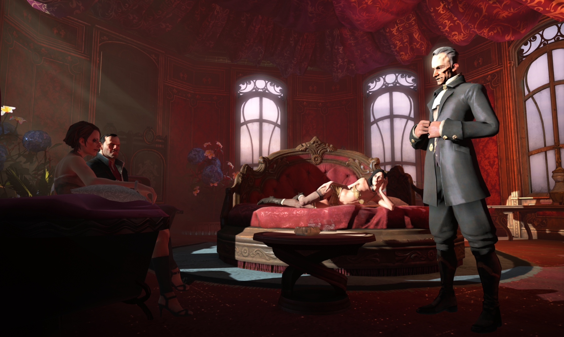
4. Darksiders
Based on the artwork of Joe Madureira, the character design of Darksiders is something of a mess. It's clear that many of the characters were designed to look 'cool', with the results being largely hit-and-miss. The absolute worst offender is the protagonist, War, who looks like some Frankenstein mixture of different 'cool' ideas, with the end result being an incohesive mess. To make matters worse still, many of the characters don't actually appear to fit together at all.
Image Source: https://blogger.googleusercontent.com/img/b/R29vZ2xl/AVvXsEiqxTPuus5drhyphenhyphenddoJXCb-b0nZt-dlSLxAJGxHaXUweOMyXQdgCLmleq91S_ZGfj5Fmvpu0UCKlgZU7pUMinl0j0MdexbxG67004yiiwPw1jsjXLICKCq7QO4dC4l6gWc0zar65YtyRL417/s400/war_armor_newpeek.jpg

5. Pokemon Black and White
As with Sonic, the designs seen in the Pokemon franchise were actually pretty decent until recently. With the latest generation, however, the designs of the monsters have become very hit-and-miss. Worse still, the designs of the human characters has also taken a turn for the worse (see below). Hopefully the next generation will see an improvement...
Image Source: https://blogger.googleusercontent.com/img/b/R29vZ2xl/AVvXsEh_sCNiXKBGjbhlIQY7_c_jkxWoNbaDiyOkOD9gu-9zYJZtBJQIvP33nwXMOSbGMPHCs6Mf_SDldGUZF-axsAOWKkYIi5WMvPlsWV9Kw-yisBdJN9GAYpem7EdaD4viBRztCeUtY_7dUe8/s320/Pokemon+Black+2+and+White+2+Characters.jpg

6. Castlevania: Judgement
God lord, what fresh hell is THIS?! For those of you who are unfamilar with it, Judgement was an utterly awful fighting game in the Castlevania series. It's greatest sin, aside from the bad gameplay, was taking the plethora of characters that had appeared in the series and redesigning all of them using the worst anime cliches imaginable. Androgynous, pretty-boy males? Check! Overly buxom women perpetually ressed like hookers? Check! Ridiculous armour and costumes that make no conceivable sense? Check! Loads of pointless accessories and trinkets? Also check! The real tragedy is that the original designs were actually pretty good...
Image Source: http://static.giantbomb.com/uploads/original/0/3693/239872-castlevaniajudgement8.jpg