Genre: Art game, Action-Adventure
Developer: Capybara Games, Superbrothers
Publisher: Capybara Games
Platform: iOS, Microsoft Windows (Steam), Mac OS X, Linux, Android
Release Date: March 24, 2011(iPad), April 27, 2011(iPhone), April 16, 2012 (Steam), May 31, 2012 (Mac, GNU/Linux), November 2012 (Android)

Image Source: http://www.microcosmologist.com/blog/wp-content/uploads/2011/12/Superbrothers-Sword-Sworcery-EP.png
Swords and Sworcery is an indie game released fairly recently that abandons 3D in favour of 2D pixel art. The pixelated characters are all designed along the mantra of 'less is more'; they are given enough to detail to make them recognisable and distinctive, but little enough to leave something to the imagination. There's even a bit of the artist's flair present within the visual design, which helps distinguish the game from other 'retro' style games.
While we're on the subject, the limitations of 8-bit graphics actually played a major role in the design of Nintendo's Super Mario. Due to the graphical limitations of arcade hardware at the time, Mario's creator Shigeru Miyamoto clothed the character in red overalls and a blue shirt to contrast against each other and the background. A red cap was added to let Miyamoto avoid drawing the character's hairstyle, forehead, and eyebrows, as well as to circumvent the issue of animating his hair as he jumped. The result? One of gaming's long-standing icons.
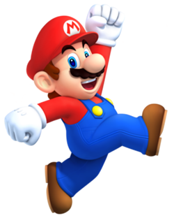
Image Source: http://images2.wikia.nocookie.net/__cb20130729184018/smashbroslawlorigins/images/7/75/Mario.png
So now for the Verdict; did Swords & Sworcery's art style result in better character design?
Yes
Sources
- Mike Snider (Nov 08, 2010). "Q&A: 'Mario' creator Shigeru Miyamoto". USA Today. Retrieved 15/10/2013
No comments:
Post a Comment