Genre: Action-Adventure
Developer: Crystal Dynamics, Eidos Montreal (Multiplayer)
Publisher: Square Enix
Platform: PlayStation 3, Xbox 360, Windows
Engine: Modified Crystal Engine
Release Date: 5 March 2013
Since her debut in 1996, the Tomb Raider series' protagonist, Lara Croft, has long been the most well-known of gaming's few female icons. She has often been described as lady version of Indiana Jones, with many of her adventures being spent exploring the ruins of ancient civilisations and legends and unlocking their secrets, hence the name of the series. However, after years of mediocre sequels and failed attempts to breathe fresh life into the franchise, it's fair to say that Lady Croft has lost a lot of her prestige.
Enter this year's Tomb Raider, a reboot of the franchise in the same vein as Ninja Theory's DMC: Devil May Cry. Framed as an origin story, the new game opts for a more serious, grounded approach to that of it's predecessors, with a major focus on survival. To reflect this, the developer has given Lara a complete overhaul, giving her realistic proportions and making her more vulnerable. However, she still possesses enough of the old design that she isn't completely unrecognisable; she still has her trademark ponytail and a blue top reminiscent of her first appearance.
How did the Fans react?
For once, we have a redesign that the fans DIDN'T throw a hissy-fit over. In fact, if anything, they rejoiced! While the old Lara Croft was indeed an icon, it's pretty clear that she meant to be some 12 year-old's fantasy Playboy girl; her stereotypically disproportionate body, with the comically oversized breasts (reportedly a result of a modelling mistake that was never fixed) and skin-tight hot pants, are obviously intended to pander to a male audience, and while she has undergone some minor changes, she's never once been intended as anything more than eye candy.
At the time of her debut, this made sense, as the gaming audience in the 90s was predominantly male. Since then, however, there has been a dramatic rise in the number of female gamers, who now make up around half of the overall audience, and with them has come a change in attitude. The simple fact is that the the old, sexist design is considered to be something of a joke these days. Naturally, this means that this more human, realistic rendition of Lara was much better received than the caricature that preceded here.
Personal Verdict
In case the tone of this particular post hasn't already given it away, I'm very much in favour of the redesign. The fact is, the old design was at best a caricature and at worst an example of just how badly women are often represented in this media. By contrast the new Lara, as with DMC's Dante, is more like an actual human being, both in her overall design and personality, which makes it much easier to relate to her throughout her struggles.
Thursday, 14 November 2013
Redesign Case Study #4: Tomb Raider
Wednesday, 13 November 2013
Redesign Case Study #3: Bomberman: Act Zero
Genre: Action
Developer: Hudson Soft
Publisher: Konami
Platform: Xbox 360
Release Date: August 3, 2006
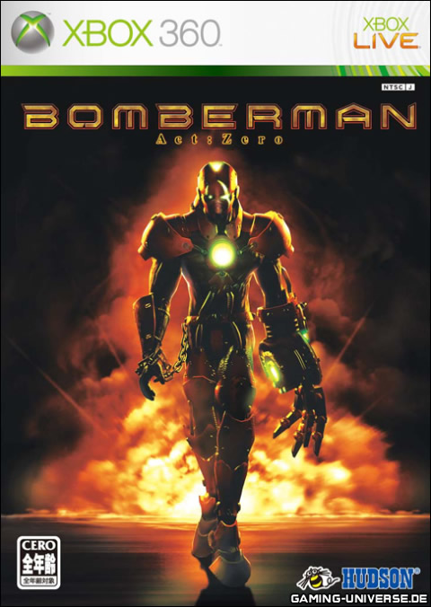
Released at the dawn of the last console generation, Bomberman Act Zero was a radical reimagining of the classic Bomberman design. Abandoning the classic cartoonish look of White Bomber, the new game instead took inspiration from the original game's boxart and portrayed it's characters as mechanical cyborgs. It is clear that this departure was an attempt to make the series 'darker, grittier and edgier' so as to appeal to a more adult audience.
How did the Fans react?
The game has been universally reviled, by fans and critics alike, and is widely considered to be terrible in all it's aspects, from presentation to gameplay. In fact, there is some debate as to whether this game is in fact worse than the infamous Sonic 2006, which was released around the same time. It's clear that, unlike other redesigns like DMC: Devil May Cry, the negative reaction is due to the sheer poor quality of the game rather than the fact that they changed it. Needless to say, this particular incarnation of Bomberman has not been seen since...
Personal Verdict
Good lord, what fresh hell is THIS?! Seriously, look at it, it looks like gimp!
Honestly, this is one of the worst designs I've ever seen! It's awful!
Redesign Case Study #2: DMC: Devil May Cry
Genre: Action-Adventure, Hack & Slash
Developer: Ninja Theory
Publisher: Capcom
Platform: PlayStation 3, Xbox 360, Windows
Engine: Unreal Engine 3
Release Date: January 15, 2013
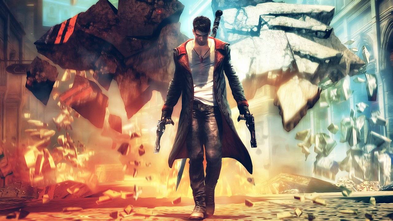
DMC: Devil May Cry is a reboot of Capcom's popular Devil May Cry series by Ninja Theory. The game was requested by Capcom themselves as they wanted the new game to be made from a Western perspective in the hopes that it would stand apart from its predecessors. The result was a more realistic, and grounded game in contrast to the over-the-top antics of previous Devil May Crys.
The biggest change present in the reboot, however, is the protagonist, Dante. In previous DMC games, he is easily recognisable by his long white hair and trademark red long coat. In the reboot, however, his appearance is radically different, now sporting short, black hair and a shorter black coat with red highlights. He's also a lot younger than his counterpart, which fits as the reboot is essentially an origin story. At the end of the day, however, he still retains many traits from the old Dante; he still wields his sword Rebellion and guns Ebony and Ivory (albeit all with new designs to fit the setting), he still wears a coat and he still spends much of the game fighting demons. It should also be note that his hair gradually turns white throughout the game, and both his hair and coat revert to their original colour scheme when the Devil Trigger ability is used, so it's clear that the original Dante has not been completely forgotten.
How did the Fans react?
To describe the fan reaction as unpleasant would be an understatement; initial reactions to Dante's redesign were overwhelmingly negative, as fans felt that the redesign was far too removed from the original design and some thought that the new Dante was overly crude and 'edgy' for the sake of it. This reaction can largely be attributed to the initial reveal trailer, which, in all fairness, did indeed portray the redesigned character as overly crude and 'edgy' for the sake of it.
In the months leading up to the game's release, however, it became apparent that the reboot still retained several aspects of the original's personality and opinions began to change, with some fans growing to like the new Dante. However, a percentage of the series' fans still despise it even to this day, with some refusing even to play the game. So, at the end of the day, reception towards the new design remains mixed.
Personal Verdict
Personally, I've never really a big fan the old design for Dante. It's not that he has a terrible design or anything and he does fit in with the setting of the games he appears in, but to me he's always come across as some stereotypical Shonen anime character (hell, he even HAS his own anime!), and while I can see why some others would like this, it's never really done anything for me.
The new Dante, on the other hand, is a lot more appealing to me. He just feels a lot more grounded and more like an actual person. A crude, cynical asshole of a person, granted, but a person nonetheless. Sure, the story can be overly anti-establishment at times, but that one's more on the writing than the character design. I will admit that as a massive fan of Ninja Theory, my opinion is probably pretty biased here, but as far as I'm concerned the new Dante is a superior design to the old one.
Monday, 11 November 2013
Redesign Case Study #1: The Legend of Zelda - The Wind Waker
Genre: Action-Adventure
Developer: Nintendo EAD
Publisher: Nintendo
Platform: Nintendo Gamecube, Wii U (HD rerelease)
Release Date: December 13, 2002
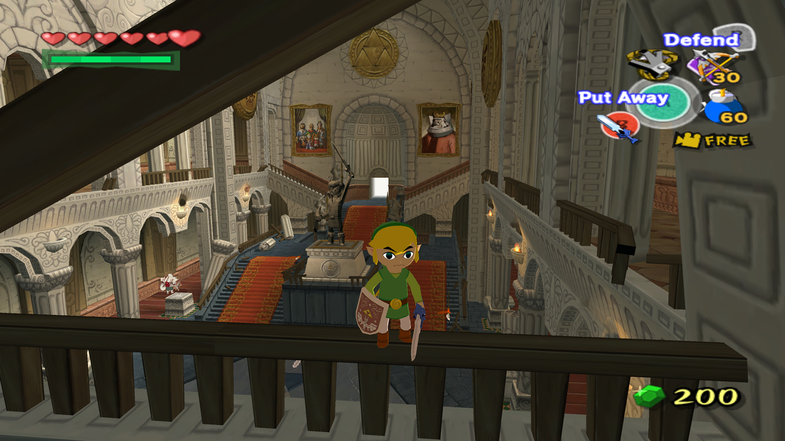
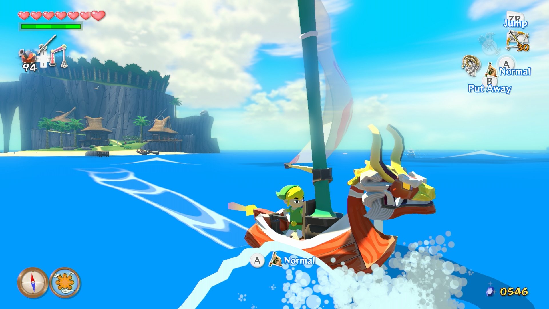
The eighth entry of the critically-acclaimed Legend of Zelda franchise, Wind Waker is most famous for it's unique 'toon' cel-shaded style. With its use of vibrant colours, hard shading and stylised effects, the game often appears more like an interactive cartoon than a video-game. It also makes use of fully real-time lighting and effects like depth of field blur to further this effect.
Naturally, the characters that inhabit this vibrant world are all suitably cartoonish, and this extends to the game's protagonist, Link; the appearance of Wind Waker's hero is far removed from that of previous installments, with his enlarged head and stumpy legs. And yet, despite his drastically different physiology, he still retains the same general look of his predecessors, including the green clothes, the floppy hat and the signature sword and shield. Furthermore, the toonish style allows Link to be far more expressive than ever before; as players explore, Link will glance around the room, and his expression will noticibly change depending on the situation.
Wind Waker has recently been rereleased on the Wii U, with smoother textures and bloom lighting
How did the Fans react?
From it's initial announcement to release, Wind Waker recieved a great deal of hatred from fans of the series. The cause of this hate was that most fans had been hoping for a more mature, realistic styled game (a desire fuelled largely by the 2000 Spaceworld Zelda demo that hinted at such a game), and viewed Wind Waker's cel-shaded aesthetic as 'childish', leading to many of them dismissing the game out of hand.
In the decade that has passed since them, however, opinions of Wind Waker's style have become much more favourable, especially with the release of Wind Waker HD. Part of this may be because of a rise of stylised games, such as Team Fortress 2, which has cause many to abandon the mistake belief that realistic graphics are inherently better and more 'mature'. People who dislike it still remain, but they are far fewer in number than they were before and most of them have turned their attentions to newer iterations
Personal Verdict
Wind Waker stands as one of my favourite games of all time, and the cel-shaded aesthetic is one of the reasons why. The fact is, it's a a charmingly beautiful game full of vibrant characters and it is a joy simply to watch. The highlight, of course, is Link himself, who is different yet so familiar at the same time. Truth be told, the game is more of a stylistic change than a full redesign, but with results like this it doesn't really matter.
Project #2: Redesigning Iconic Characters
Ok, next project. I've decided to just skip ahead and do the Redesign mini-project. Also I'm calling it a project this time around, as it's less about proving something right and more about messing around to see what will happen.
Look at the following Iconic Characters and redesign them:-
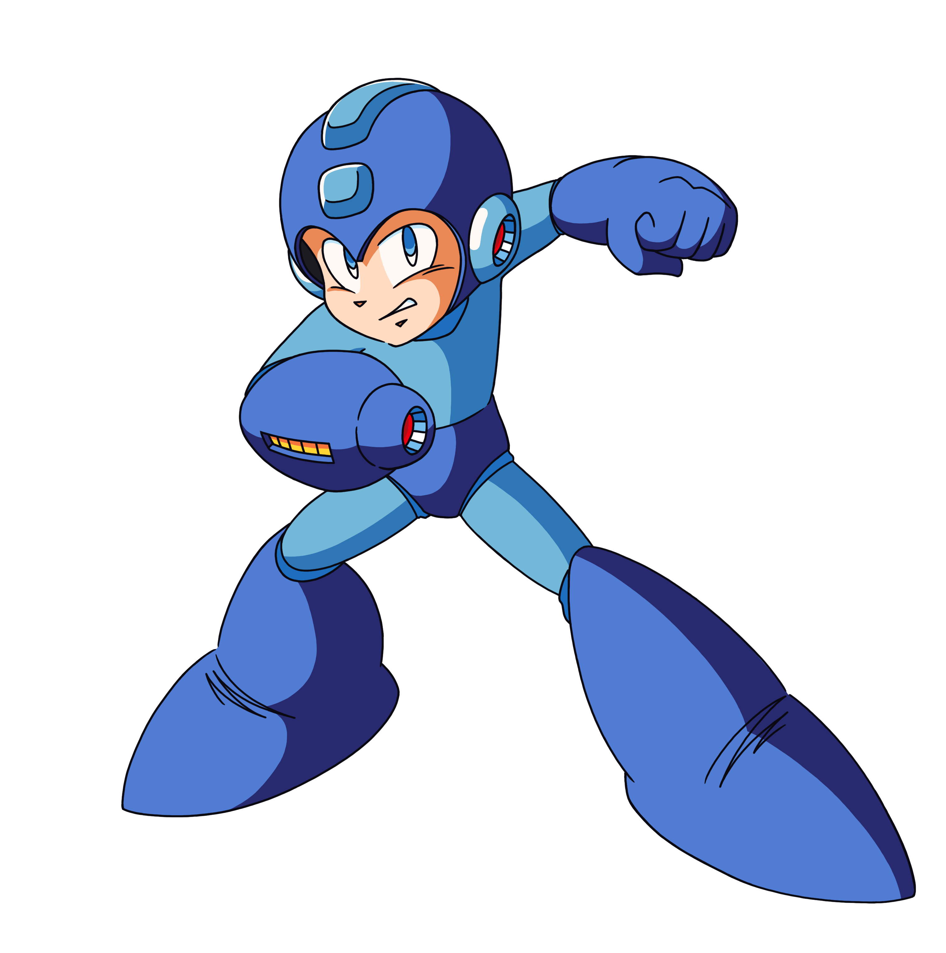
1. Mega Man
2. Master Chief
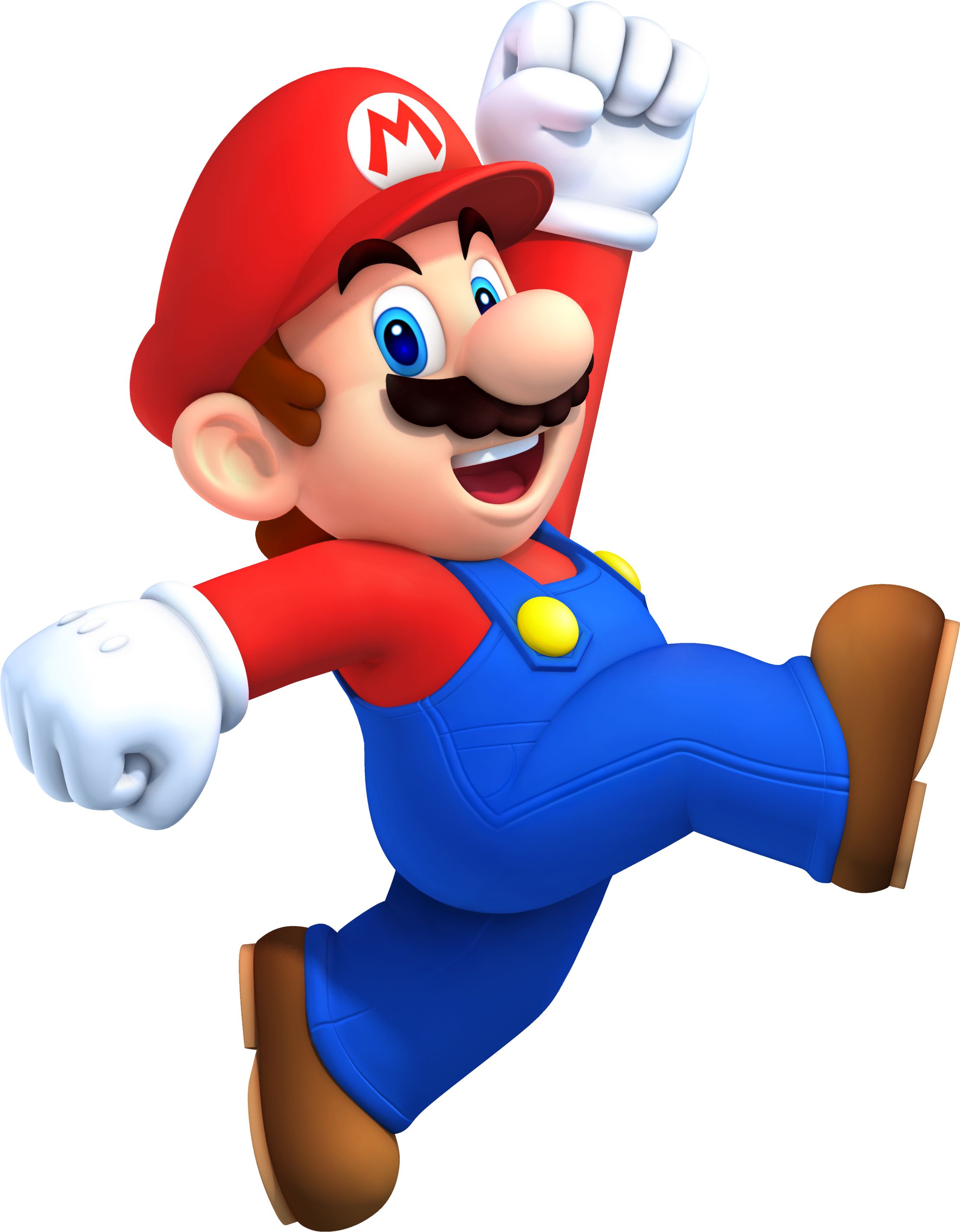
3. Mario
I may also do a few more, depending on how long the first 3 take. The extras (should I choose to do them) will be :-
- Sonic the Hedgehog
- Samus Aran
- Batman (yeah, I know he's technically a comic-book character, but he has appeared in a lot of video-games so...)
Hopefully this one won't take nearly as long as the last one...
Look at the following Iconic Characters and redesign them:-
1. Mega Man
2. Master Chief
3. Mario
- Sonic the Hedgehog
- Samus Aran
- Batman (yeah, I know he's technically a comic-book character, but he has appeared in a lot of video-games so...)
Hopefully this one won't take nearly as long as the last one...
Hypothesis #1: Conclusion
After a lengthy and prolonged period of research and practice, I've come to a conclusion regarding my investigation into the impact of style on character design. The result?
A strong aesthetic style can help good character design, as it provides a solid foundation for how characters should appear (i.e. a guideline for various characters' proportions), as well as helping those designs stand out from the crowd. It can also be used to give an existing design a fresh coat of paint.
HOWEVER...
It is NOT an absolute requirement for good character design. Proof of this can be seen in the innumerable good designs that don't use a particular aesthetic style.
In other words, I've found that my hypothesis on the impact of style is FALSE
Friday, 8 November 2013
Style Practical: Character Designs
Got both the characters finished, sooo... yeah, here they are:-
And here's the development work for anyone who's interested (there isn't much, just a few of trial and error sketches until I had designs I liked):-
As far as results go, I'm fairly happy with both of them. Next post will be the conclusion of the Style investigation.
The Barbarian
The Engineer
And here's the development work for anyone who's interested (there isn't much, just a few of trial and error sketches until I had designs I liked):-
As far as results go, I'm fairly happy with both of them. Next post will be the conclusion of the Style investigation.
Subscribe to:
Posts (Atom)


