Genre: FPS, Multiplayer
Developer: Valve Corporation
Platform: Windows, Xbox 360, PlayStation 3, OS X, Linux
Engine: Source
Release Date: October 9, 2007
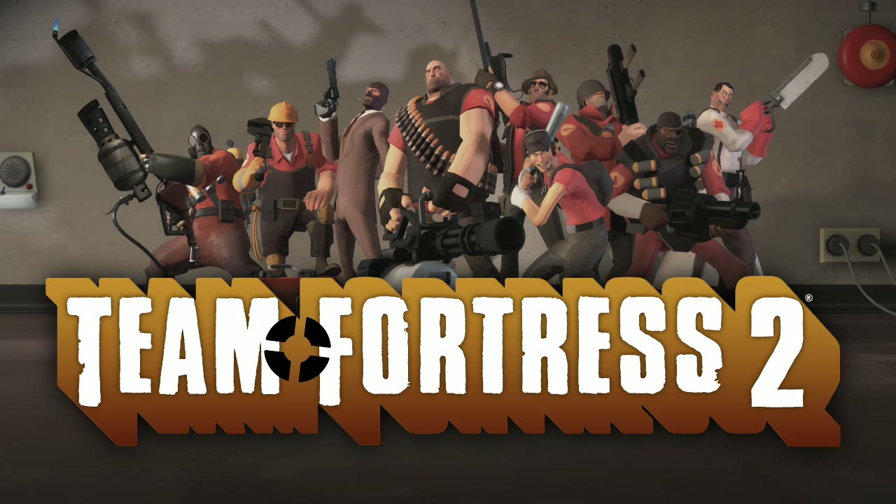
Image Source: http://i1-news.softpedia-static.com/images/news2/Team-Fortress-2-and-Source-Engine-Get-Steam-Fix-2.jpg?1353492703
The sequel to a 1996 Half-Life mod, Team Fortress 2 spent the early days of it's 10-year development cycle resembling other military shooters at the time, such as Counter-Strike. Screenshots of the earliest builds of the game reveal a very typical photorealistic aesthetic, resulting in a very bland, uninteresting look that did little to differentiate itself from its competitors. It was also hard to tell the different characters apart as they all looked the same.

Image Source: http://media.bestofmicro.com/A-screenshot-of-the-early-design-shows-a-similar-look-to-Counter-Strike,0-M-94630-13.jpg

Image Source: http://randomaniac.us/wp-content/uploads/2011/09/tf29.jpg
So now for the Verdict; did Team Fortress 2's art style result in better character design?
Yes
Sources
- J. Mitchell, M. Francke, & D. Eng (2007). Illustrative Rendering in Team Fortress 2. Valve Corporation.
- Valve Corporation (2008). Stylization with a Purpose - The Illustrative World of Team Fortress 2. San Fransisco, Game Developers Conference 2008.
No comments:
Post a Comment