Monday 24 February 2014

Classic Monsters Case Study #2: Cthulhu

"In his house at R'lyeh,
dead Cthulhu waits dreaming."

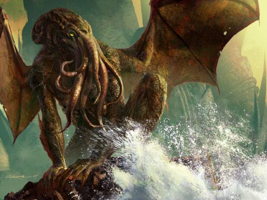
The most well-known of horror writer H.P. Lovecraft's creations, Cthulhu is one of the Great Old Ones, a group of powerful, primordial and malignant cosmic entities that are said to be present on Earth. Cthulhu himself lays dormant within an underwater city in the South Pacific called R'lyeh, where he waits to be awakened and let loose upon the world again. Despite his imprisonment, however, the elder god is apparently the source of constant anxiety for mankind at a subconscious level, and also the subject of worship by a number of human religions. 

The monstrosity makes his first appearance in Lovecraft's 1928 short story, The Call of Cthulhu, which details the discovery of the elder god's existence, encounters with a cult that worships him and finally the accidental release of Cthulhu himself at the story's climax. There are also several references made to the entity in later works of Lovecraft's so-called Cthulhu Mythos, many of which suggest vague links to other such entities. It is interesting to note, however, that while Cthulhu is certainly the most well-known of Lovecraft's fictional deities, he is not the most powerful; that honour goes to one of the Outer Gods, such as Azathoth, Nyarlathotep and Yog-Sothoth.
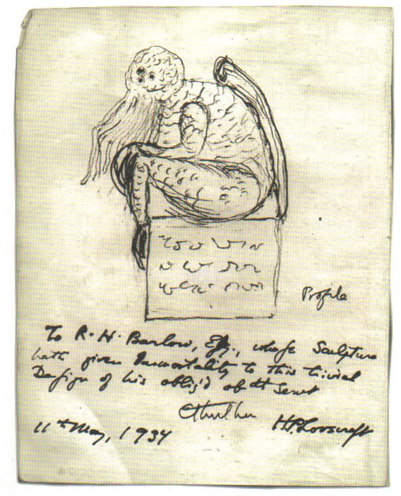
A sketch of Cthulhu by H.P. Lovecraft in 1934
Cthulhu is consistently described as a mix between a giant human, an octopus, and a dragon. Typical depictions show an octopus-like head, and a vaguely humanoid body with large, rudimentary wings. Lovecraft himself describes the elder god as "A monster of vaguely anthropoid outline, but with an octopus-like head whose face was a mass of feelers, a scaly, rubbery-looking body, prodigious claws on hind and fore feet, and long, narrow wings behind." Other references to the creature's appearance note that the  "thing cannot be described," but it is called "the green, sticky spawn of the stars", with "flabby claws" and an "awful squid-head with writhing feelers." The character that meets Cthulhu face-to-face also uses the phrase "a mountain walked or stumbled" when describing its movement, which gives a sense of scale to its size.

Yeah, I'm probably going to give this guy the 'Guillermo del Toro' treatment

Classic Monsters Design #1: Jabberwocky

Just finished the redesign of the Jabberwock, so here it is.
Once again, did all the concept work on pen and paper. You can also see the poem itself to the left of the sketches; it was there that I did my analysis of it and extrapolated what I could about the creature itself. From there, I focussed on sketching designs that reflected that description.

Design Sketches for the redesigned Jabberwock

You can see the end result above. My vision of the Jabberwock is a long, serpent-like beast that crawls on all fours, quietly snaking through the trees as it goes. It's fair to say that this is a rather radical departure from how it is usually depicted, but despite that, this design still retains a few elements from the original, namely the whiskers and the two 'hair' tendrils. It also still has wings, though they've now been downgraded to fins on its back (this Jabberwock cannot fly)
Next up is Cthulhu. Expect tentacles.

Wednesday 19 February 2014

Classic Monsters Case Study #1: Jabberwocky


'Twas brillig, and the slithy toves
Did gyre and gimble in the wabe;
All mimsy were the borogoves,
And the mome raths outgrabe.

"Beware the Jabberwock, my son!
The jaws that bite, the claws that catch!
Beware the Jubjub bird, and shun
The frumious Bandersnatch!"

He took his vorpal sword in hand:
Long time the manxome foe he sought—
So rested he by the Tumtum tree,
And stood awhile in thought.

And as in uffish thought he stood,
The Jabberwock, with eyes of flame,
Came whiffling through the tulgey wood,
And burbled as it came!

One, two! One, two! and through and through
The vorpal blade went snicker-snack!
He left it dead, and with its head
He went galumphing back.

"And hast thou slain the Jabberwock?
Come to my arms, my beamish boy!
O frabjous day! Callooh! Callay!"
He chortled in his joy.

'Twas brillig, and the slithy toves
Did gyre and gimble in the wabe;
All mimsy were the borogoves,
And the mome raths outgrabe.

A nonsense poem written by Lewis Carroll, Jabberwocky tells of a young man who ventures into a strange, dangerous forest to kill the titular creature that lives there. It originally appeared in Through the Looking Glass and What Alice Found There, the sequel to Alice's Adventures in Wonderland (1865), and as such the creature, along with other elements from the poem, often features in works based on Alice in Wonderland.

The Jabberwock itself is described sparingly, with only a few details given about its nature and appearance, and many of the words used to do so are made up (it is a nonsense poem after all). As such, most depictions of the monster are based on an illustration from Through the Looking Glass by John Tenniel (seen above).

For my own Jabberwock design, I decided to dissect the poem and base my concept off what little I could gleam from it... which, surprisingly, was quite a lot. For one thing, I found that the poem mentions nothing about it having wings or even flying. I also noted the following:-
  • The jaws that bite - The fact that the poem draws attention to them suggests that the Jabberwock's jaws are quite noticeable, and like it likes to use them
  • The claws that catch - Suggests the creature likes to grab it's prey, which in turn suggests long, dextrous limbs
  • Long time the manxome foe he sought - The key word here is manxome, one of the many nonsense words used. Apparently it means 'fearsome', but it's also a portmanteau of 'manly' and 'buxom'
  • With eyes of flame - Again, like the mouth and claws, this suggests the eyes are quite noticeable, probably because they are large and possibly glowing
  • Came whiffling through the tulgey wood - Despite being another nonsense word, describing the Jabberwocky's movements as 'whiffling' is actually quite telling. It doesn't sound like something that crashes through the trees or comes swooping down; instead it almost sounds like its slithering or gliding.
  • And burbled as it came - More of a minor detail really, but as with 'whiffling', the choice of words suggests something about the creature. It's not loud or shrill, suggesting the creature may be slowly stalking its quarry
  • and with its head - It has a clearly defined head. ...Ok, I'll admit, I'm grasping at straws with this one
Anyway, that's enough research and exposition. Next post will show the concept and design of the Jabberwock

Redesign Conclusion/ Classic Monsters Brief

So, after about several months and about 5 different characters, the Redesign Project comes to an end. Went on a little longer than I intended it to, but hey, I got some good work out of it.

As for what I've learned (what, did you think I was just messing with these characters for the hell of it?), I now have something of a theory surrounding what makes a particular character design iconic. My formula is as follow:-
  • 2-3 Unique Characteristics - An iconic design is mainly the result of a few easily recognisable details, preferably things that can be seen on a silhouette. The Teenage Mutant Ninja Turtles are a great example of what I mean; doesn't matter how you alter the designs, as long as you have the bandanas, the turtle shells and the ninja weapons, you will always be able to recognise the Teenage Mutant Ninja Turtles. The same principle applies to other iconic characters
  • One Characteristic on the head - Building on the last point, at least one of the defining characteristics has to be placed on the character's head. Examples include Mario's hat, Master Chief's helmet, Hellboy's horns and even Cloud Strife's spiky hair. It can be anything, just so long as its a major detail and its on their face or noggin. Again, it's best if you can see this detail in the silhouette
  • 1-2 major Colours - The colour pallete of an iconic character is predominantly made up of only one or two major colours. These colours can appear in different shades, and others can be used for minor details, but the main colours are always the most apparent. Sonic is blue, Pikachu is yellow and the Incredible Hulk is green. Now, I'll admit, this one isn't as iron-clad as the others (some characters don't have a defined colour pallete, some have more than 2 colours etc.) but it certainly helps
  • And as Always, Less is More - This last one is just a general rule of good design, really, but it's still appropriate. Basically, the design can't be too complicated. Adding in little details and textures is fine here and there, but never use 100 shapes/ lines etc. when 5 will do just fine. Some of the most iconic characters often have very basic designs
Now, at this point, this is just a theory, one I intend to test further with future projects. Speaking of which...
My next project is going to be based on Classic Monsters.
Basically I'll be taking a few particularly well-known creatures and monsters and apply the same treatment to them as the redesigns; alter their designs while trying to retain the essence of the character. The four monsters I've chosen all follow the 'iconic character' guideline from above (more or less). They are:-

  • The Jabberwocky from the poem by Lewis Caroll
  • The Elder God Cthulhu from the works of H.P. Lovecraft
  • Medusa the Gorgon from Greek Mythology
  • Satan/ Lucifer/ The Devil from Catholicism
I've already cracked on with the first one, so you shouls be seeing that one soon. I'll probably also do a quick case-study before each one just to give a quick overview of the lore surrounding them all.
Now, if you don't mind, I have some work to do

Character Redesign #5: Samus Aran

Last redesign! Probably should've ended this project with Mario or Sonic, but I really wanted to do a female character, so... yeah, here's Samus from Metroid.

An intergalactic bounty hunter clad in an advanced armour-suit, Samus Aran is a force to be reckoned with. Armed with a myriad of weapons and abilities, she is often seen blazing through extraterrestrial worlds eradicating anything she comes across, which usually includes the bloodthirsty hordes of the Space Pirates and the alien bio-weapons known as Metroids. Based on the character of Ellen Ripley from the Alien franchise (a series the Metroid franchise pays many homages to), her gender was not revealed until the end of the first game, with the reveal itself being a shock for many gamers at the time.
Image Source: http://static.comicvine.com/uploads/original/10/102595/2424546-samus04.jpg
Image Source: http://lvls.files.wordpress.com/2011/08/rvl_smb_szerosuit_001.jpg

The thing about Samus is that she actually has two designs; one for her armour and another for the woman underneath. Now, the armour is pretty damn iconic. The massive shoulders, the classic helmet with the green visor, the massive arm cannon. It's all easily recognisable and personally, I think it looks pretty cool.
 ...Zero-suit Samus, on the other hand, looks like an anime stripper. Heck, just look at the image above and you'll see exactly what I mean; she's designed purely so she looks sexy. Worse, it doesn't at all reflect the character you play as in the games; she doesn't look like a solitary, battle-hardened warrior, she looks like a bloody super-model! Needless to say, I felt compelled to change this.
During the planning stage of the redesign, Josh suggested that I use traditional pen-and paper as opposed to sketching in Photoshop as I had before, resulting in the images above. It's been awhile since I've done this, but after this particular task, it's hard to argue with the results; I managed to produce nearly five times the amount of concept work in about a quarter of the time.
As far as the designs themselves go, the goals were simple; make the armour look more alien (the character's backstory specifically mentions that it isn't man-made) and possibly bulkier, and make Samus herself less sexualised
And here we have the design itself. The armour is based on several design motifs from the Chozo, an bird-like alien species with a recurring presence in the series, namely the layering of plates and the bulkier upper torso. I also tried to make it the material of the armour look more brassy, similar to an old diver suit.
As for Samus herself, well you can see for yourself; I've shortened the hair, given her a more realistic body and added some scars to her face. I've also given her eyes similar to a bird of prey, as she is supposed to be infused with the DNA of the bird-like Chozo who I mentioned before.

Overall, I'm fairly happy with how this design turned out.

Tuesday 18 February 2014

Sonic Redesign mk. II and Sonic Boom Reaction

As I mentioned at the end of the Sonic redesign post, I wasn't completely happy with what I'd created; the overall design was fine, but a few elements were a bit... off. Anyways, Josh agreed and he encouraged me to do another version, which you can see below
As you can see, I kept the general look and anatomy of the original redesign, but instead added blocky, more angular spikes as opposed to the more realistic 'comb-brush' look from before. I also used a more cel-shaded style, which in my opinion worked a lot better for the design. Overall, this one turned out a lot better than the previous version.

Now, while we're on the subject of Sonic redesigns, there has been a recent development within the industry itself that I think I should give my thoughts on...
As many of you will have heard by now, SEGA have recently commissioned a new Sonic TV series, complete with a tie-in game for Wii U and 3DS, titled Sonic Boom. The new project will apparently act as some kind of reboot to the franchise, but the things that has turned the most heads is the fact that many of the main characters have undergone some rather drastic redesigns (see below)
Image Source: http://assets.vg247.com/current//2014/02/sonic-boom22.jpg
So, you ask, what are my thoughts? Well, honestly, I'm all for a reboot of this franchise. Truth be told, Sonic could really benefit from a refresh and considering the team working on the game are all supposedly former Naughty Dog and Insomniac, I think we could be in for a treat.
As for the new designs themselves, I'm okay with most of them. Tails and Amy are largely the same, albeit with a few extra accessories to fit their roles/ personalities. Even Sonic himself doesn't look too different, but most of the changes made are alright; I like that his spines are more ruffled and the neck scarf is a nice little addition. I'm even okay with the fact his arms are now blue; it's a minor detail and it really doesn't take anything away. That being said, he's still way too lanky and whoever added the bandages clearly went overboard.
However, the main concern is Knuckles; he looks like he's been binging on steroids and... well, I'm not sure how I feel about that. On the one hand, it does add a bit of diversity to the body types and it does fit his role as a brawler. On the other hand... might be just the promo render, but it kinds looks like they just plonked Knuckles' head on the 'roided up body. I dunno, it might be just because its such a drastic change, but it just looks a bit off. Who knows, maybe it'll grow on me in time...

Anyways, that's enough Sonic. next up is the final redesign; Samus Aran from Metroid

Character Redesign #4: Sonic the Hedgehog

If you've been keeping up with my blog thus far, you'll remember that post about bad character designs where I basically tore into the current design of SEGA's spiny blue mascot. Well, as my current project revolves around taking iconic characters and changing them, I saw this as a perfect opportunity to right this particular wrong.

As with Mario, Sonic is a character everyone recognises; he's a blue, cartoon hedgehog who can run insanely fast and whose trademark moves involve his spin-dash (i.e, curling up and spinning) and running around loops. He spends most of his games thwarting the plans of his nemesis, Dr. Robotnik (I refuse to call him Eggman...).
Image Source: http://www.sonicstadium.org/wp-content/uploads/2011/04/Sonic-Generations-artwork.jpg

I believe I covered exactly what is wrong with Sonic's current design in my previous post; his spines are too long and floppy and he's too lanky by half. However, these flaws aside, his overall design is actually pretty iconic, with his most recognisable traits being the blue, curved spines, as well as his signature red shoes.
Design sketches for Sonic's redesign

One of the main goals with the redesign was to make Sonic appear more like an actual hedgehog (because let's be honest, his current design barely look like one). That being said, I originally wanted a much more conservative design, as the sketches on the left show. However, I was eventually tried something more like an actual hedgehog, resulting in the design below.

Here's the first version of Sonic's redesign. Truth be told, I wasn't 100% happy with how this turned out (the 'realistic fur didn't look right to me) and I eventually did an altogether different variation
...Which, you'll see on my next post. Sorry, but this one's getting too long as it is.