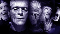
As for what I've learned (what, did you think I was just messing with these characters for the hell of it?), I now have something of a theory surrounding what makes a particular character design iconic. My formula is as follow:-
- 2-3 Unique Characteristics - An iconic design is mainly the result of a few easily recognisable details, preferably things that can be seen on a silhouette. The Teenage Mutant Ninja Turtles are a great example of what I mean; doesn't matter how you alter the designs, as long as you have the bandanas, the turtle shells and the ninja weapons, you will always be able to recognise the Teenage Mutant Ninja Turtles. The same principle applies to other iconic characters
- One Characteristic on the head - Building on the last point, at least one of the defining characteristics has to be placed on the character's head. Examples include Mario's hat, Master Chief's helmet, Hellboy's horns and even Cloud Strife's spiky hair. It can be anything, just so long as its a major detail and its on their face or noggin. Again, it's best if you can see this detail in the silhouette
- 1-2 major Colours - The colour pallete of an iconic character is predominantly made up of only one or two major colours. These colours can appear in different shades, and others can be used for minor details, but the main colours are always the most apparent. Sonic is blue, Pikachu is yellow and the Incredible Hulk is green. Now, I'll admit, this one isn't as iron-clad as the others (some characters don't have a defined colour pallete, some have more than 2 colours etc.) but it certainly helps
- And as Always, Less is More - This last one is just a general rule of good design, really, but it's still appropriate. Basically, the design can't be too complicated. Adding in little details and textures is fine here and there, but never use 100 shapes/ lines etc. when 5 will do just fine. Some of the most iconic characters often have very basic designs
Now, at this point, this is just a theory, one I intend to test further with future projects. Speaking of which...
My next project is going to be based on Classic Monsters.
Basically I'll be taking a few particularly well-known creatures and monsters and apply the same treatment to them as the redesigns; alter their designs while trying to retain the essence of the character. The four monsters I've chosen all follow the 'iconic character' guideline from above (more or less). They are:-
- The Jabberwocky from the poem by Lewis Caroll
- The Elder God Cthulhu from the works of H.P. Lovecraft
- Medusa the Gorgon from Greek Mythology
- Satan/ Lucifer/ The Devil from Catholicism
I've already cracked on with the first one, so you shouls be seeing that one soon. I'll probably also do a quick case-study before each one just to give a quick overview of the lore surrounding them all.
Now, if you don't mind, I have some work to do

No comments:
Post a Comment