We all know Mario. Plumber who jumps on turtles. Eats mushrooms to grow bigger. Regularly rescues a princess from his arch-nemesis Bowser. Everyone knows Mario.
His overall design is particularly noteworthy for many reasons, not least because of how little it as changed over the years. However, by far the most interesting thing is how he was originally conceived; everything about his design was based on the limitations of the Nintendo Entertainment System (his hat was so they didn't have to animate hair, his dungarees were so we could see his arms, mustache was added to highlight his nose etc.), making the jumping plumber a brilliant example of minimalist character design.
Image Source: http://blog.lib.umn.edu/sinkx004/myblog/Pixelated_NES_Mario_by_danny1337.png
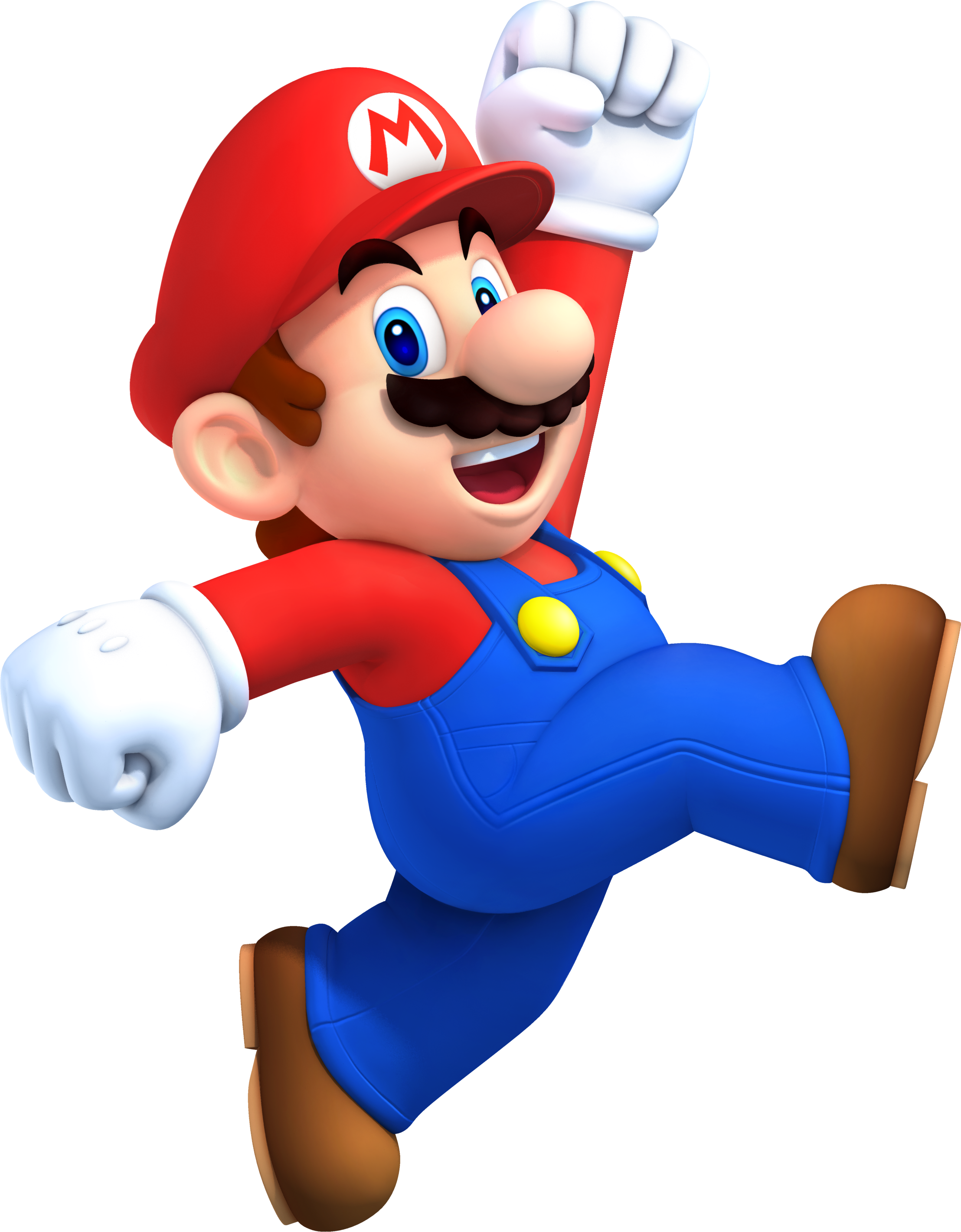
Image Source: http://static4.wikia.nocookie.net/__cb20120816162011/mario/images/1/15/MarioNSMB2.png

Design sketches for the Mario Redesign

Next post will be the fourth redesign, Sonic the Hedgehog
No comments:
Post a Comment