Wednesday, 19 February 2014

Redesign Conclusion/ Classic Monsters Brief

So, after about several months and about 5 different characters, the Redesign Project comes to an end. Went on a little longer than I intended it to, but hey, I got some good work out of it.

As for what I've learned (what, did you think I was just messing with these characters for the hell of it?), I now have something of a theory surrounding what makes a particular character design iconic. My formula is as follow:-
  • 2-3 Unique Characteristics - An iconic design is mainly the result of a few easily recognisable details, preferably things that can be seen on a silhouette. The Teenage Mutant Ninja Turtles are a great example of what I mean; doesn't matter how you alter the designs, as long as you have the bandanas, the turtle shells and the ninja weapons, you will always be able to recognise the Teenage Mutant Ninja Turtles. The same principle applies to other iconic characters
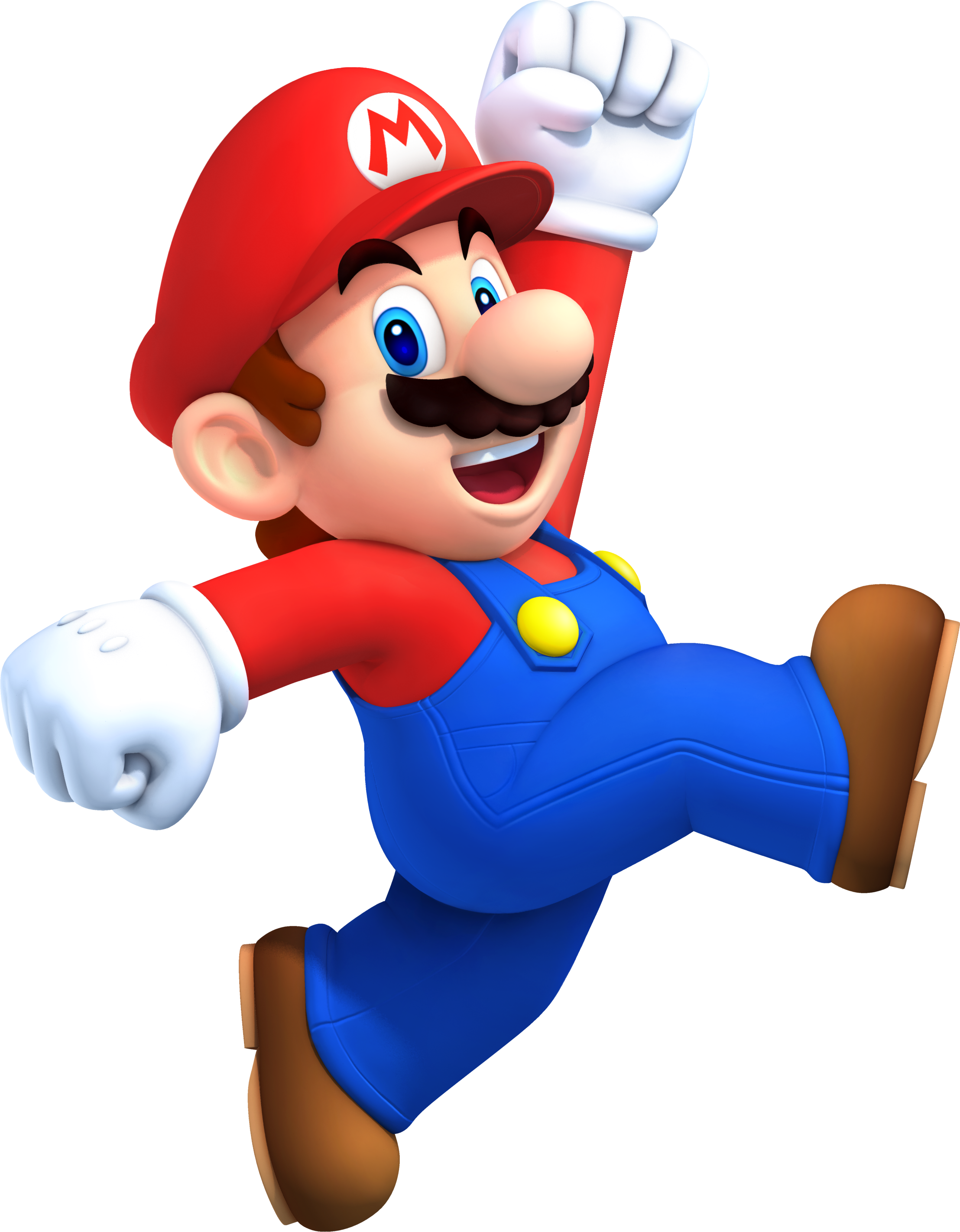
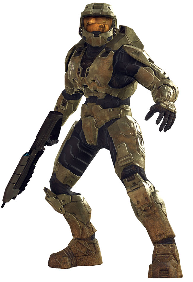
  • One Characteristic on the head - Building on the last point, at least one of the defining characteristics has to be placed on the character's head. Examples include Mario's hat, Master Chief's helmet, Hellboy's horns and even Cloud Strife's spiky hair. It can be anything, just so long as its a major detail and its on their face or noggin. Again, it's best if you can see this detail in the silhouette
  • 1-2 major Colours - The colour pallete of an iconic character is predominantly made up of only one or two major colours. These colours can appear in different shades, and others can be used for minor details, but the main colours are always the most apparent. Sonic is blue, Pikachu is yellow and the Incredible Hulk is green. Now, I'll admit, this one isn't as iron-clad as the others (some characters don't have a defined colour pallete, some have more than 2 colours etc.) but it certainly helps
  • And as Always, Less is More - This last one is just a general rule of good design, really, but it's still appropriate. Basically, the design can't be too complicated. Adding in little details and textures is fine here and there, but never use 100 shapes/ lines etc. when 5 will do just fine. Some of the most iconic characters often have very basic designs
Now, at this point, this is just a theory, one I intend to test further with future projects. Speaking of which...
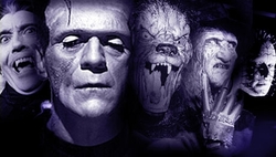
My next project is going to be based on Classic Monsters.
Basically I'll be taking a few particularly well-known creatures and monsters and apply the same treatment to them as the redesigns; alter their designs while trying to retain the essence of the character. The four monsters I've chosen all follow the 'iconic character' guideline from above (more or less). They are:-

  • The Jabberwocky from the poem by Lewis Caroll
  • The Elder God Cthulhu from the works of H.P. Lovecraft
  • Medusa the Gorgon from Greek Mythology
  • Satan/ Lucifer/ The Devil from Catholicism
I've already cracked on with the first one, so you shouls be seeing that one soon. I'll probably also do a quick case-study before each one just to give a quick overview of the lore surrounding them all.
Now, if you don't mind, I have some work to do

Character Redesign #5: Samus Aran

Last redesign! Probably should've ended this project with Mario or Sonic, but I really wanted to do a female character, so... yeah, here's Samus from Metroid.

An intergalactic bounty hunter clad in an advanced armour-suit, Samus Aran is a force to be reckoned with. Armed with a myriad of weapons and abilities, she is often seen blazing through extraterrestrial worlds eradicating anything she comes across, which usually includes the bloodthirsty hordes of the Space Pirates and the alien bio-weapons known as Metroids. Based on the character of Ellen Ripley from the Alien franchise (a series the Metroid franchise pays many homages to), her gender was not revealed until the end of the first game, with the reveal itself being a shock for many gamers at the time.
Image Source: http://static.comicvine.com/uploads/original/10/102595/2424546-samus04.jpg
Image Source: http://lvls.files.wordpress.com/2011/08/rvl_smb_szerosuit_001.jpg

The thing about Samus is that she actually has two designs; one for her armour and another for the woman underneath. Now, the armour is pretty damn iconic. The massive shoulders, the classic helmet with the green visor, the massive arm cannon. It's all easily recognisable and personally, I think it looks pretty cool.
 ...Zero-suit Samus, on the other hand, looks like an anime stripper. Heck, just look at the image above and you'll see exactly what I mean; she's designed purely so she looks sexy. Worse, it doesn't at all reflect the character you play as in the games; she doesn't look like a solitary, battle-hardened warrior, she looks like a bloody super-model! Needless to say, I felt compelled to change this.
During the planning stage of the redesign, Josh suggested that I use traditional pen-and paper as opposed to sketching in Photoshop as I had before, resulting in the images above. It's been awhile since I've done this, but after this particular task, it's hard to argue with the results; I managed to produce nearly five times the amount of concept work in about a quarter of the time.
As far as the designs themselves go, the goals were simple; make the armour look more alien (the character's backstory specifically mentions that it isn't man-made) and possibly bulkier, and make Samus herself less sexualised
And here we have the design itself. The armour is based on several design motifs from the Chozo, an bird-like alien species with a recurring presence in the series, namely the layering of plates and the bulkier upper torso. I also tried to make it the material of the armour look more brassy, similar to an old diver suit.
As for Samus herself, well you can see for yourself; I've shortened the hair, given her a more realistic body and added some scars to her face. I've also given her eyes similar to a bird of prey, as she is supposed to be infused with the DNA of the bird-like Chozo who I mentioned before.

Overall, I'm fairly happy with how this design turned out.

Tuesday, 18 February 2014

Sonic Redesign mk. II and Sonic Boom Reaction

As I mentioned at the end of the Sonic redesign post, I wasn't completely happy with what I'd created; the overall design was fine, but a few elements were a bit... off. Anyways, Josh agreed and he encouraged me to do another version, which you can see below
As you can see, I kept the general look and anatomy of the original redesign, but instead added blocky, more angular spikes as opposed to the more realistic 'comb-brush' look from before. I also used a more cel-shaded style, which in my opinion worked a lot better for the design. Overall, this one turned out a lot better than the previous version.

Now, while we're on the subject of Sonic redesigns, there has been a recent development within the industry itself that I think I should give my thoughts on...
As many of you will have heard by now, SEGA have recently commissioned a new Sonic TV series, complete with a tie-in game for Wii U and 3DS, titled Sonic Boom. The new project will apparently act as some kind of reboot to the franchise, but the things that has turned the most heads is the fact that many of the main characters have undergone some rather drastic redesigns (see below)
Image Source: http://assets.vg247.com/current//2014/02/sonic-boom22.jpg
So, you ask, what are my thoughts? Well, honestly, I'm all for a reboot of this franchise. Truth be told, Sonic could really benefit from a refresh and considering the team working on the game are all supposedly former Naughty Dog and Insomniac, I think we could be in for a treat.
As for the new designs themselves, I'm okay with most of them. Tails and Amy are largely the same, albeit with a few extra accessories to fit their roles/ personalities. Even Sonic himself doesn't look too different, but most of the changes made are alright; I like that his spines are more ruffled and the neck scarf is a nice little addition. I'm even okay with the fact his arms are now blue; it's a minor detail and it really doesn't take anything away. That being said, he's still way too lanky and whoever added the bandages clearly went overboard.
However, the main concern is Knuckles; he looks like he's been binging on steroids and... well, I'm not sure how I feel about that. On the one hand, it does add a bit of diversity to the body types and it does fit his role as a brawler. On the other hand... might be just the promo render, but it kinds looks like they just plonked Knuckles' head on the 'roided up body. I dunno, it might be just because its such a drastic change, but it just looks a bit off. Who knows, maybe it'll grow on me in time...

Anyways, that's enough Sonic. next up is the final redesign; Samus Aran from Metroid

Character Redesign #4: Sonic the Hedgehog

If you've been keeping up with my blog thus far, you'll remember that post about bad character designs where I basically tore into the current design of SEGA's spiny blue mascot. Well, as my current project revolves around taking iconic characters and changing them, I saw this as a perfect opportunity to right this particular wrong.

As with Mario, Sonic is a character everyone recognises; he's a blue, cartoon hedgehog who can run insanely fast and whose trademark moves involve his spin-dash (i.e, curling up and spinning) and running around loops. He spends most of his games thwarting the plans of his nemesis, Dr. Robotnik (I refuse to call him Eggman...).
Image Source: http://www.sonicstadium.org/wp-content/uploads/2011/04/Sonic-Generations-artwork.jpg

I believe I covered exactly what is wrong with Sonic's current design in my previous post; his spines are too long and floppy and he's too lanky by half. However, these flaws aside, his overall design is actually pretty iconic, with his most recognisable traits being the blue, curved spines, as well as his signature red shoes.
Design sketches for Sonic's redesign

One of the main goals with the redesign was to make Sonic appear more like an actual hedgehog (because let's be honest, his current design barely look like one). That being said, I originally wanted a much more conservative design, as the sketches on the left show. However, I was eventually tried something more like an actual hedgehog, resulting in the design below.

Here's the first version of Sonic's redesign. Truth be told, I wasn't 100% happy with how this turned out (the 'realistic fur didn't look right to me) and I eventually did an altogether different variation
...Which, you'll see on my next post. Sorry, but this one's getting too long as it is.

Tuesday, 21 January 2014

Character Redesign #3: Mario

Another post, another redesign; this time it's Nintendo's main man, Mario!

We all know Mario. Plumber who jumps on turtles. Eats mushrooms to grow bigger. Regularly rescues a princess from his arch-nemesis Bowser. Everyone knows Mario.
His overall design is particularly noteworthy for many reasons, not least because of how little it as changed over the years. However, by far the most interesting thing is how he was originally conceived; everything about his design was based on the limitations of the Nintendo Entertainment System (his hat was so they didn't have to animate hair, his dungarees were so we could see his arms, mustache was added to highlight his nose etc.), making the jumping plumber a brilliant example of minimalist character design.

Image Source: http://blog.lib.umn.edu/sinkx004/myblog/Pixelated_NES_Mario_by_danny1337.png
Image Source: http://static4.wikia.nocookie.net/__cb20120816162011/mario/images/1/15/MarioNSMB2.png

To be perfectly honest, redesigning this guy was a pain in the arse. There's nothing particularly wrong with his design and there's not a lot you can change without losing the essence of the character. Fortunately, I noticed that Nintendo's mascot is mostly made of rounded shapes and had a large head. So, naturally, I decided to do the opposite.
Design sketches for the Mario Redesign

And here's the final result. As you can see, I went for a bulkier, blockier build with a smaller head. As such, it has been dubbed 'Wreck-It Mario' by my peers, although honestly it was intended as a design for a TeamFortress2-esque reimagining of the famous plumber (hell, that's the TF2 colour palette in the corner). Overall, though, I'm pleased with how it turned out.
Next post will be the fourth redesign, Sonic the Hedgehog

Tuesday, 14 January 2014

Character Redesign #2: Master Chief

The next redesign is Master Chief from the Halo franchise.
The Chief is an elite supersoldier known as a SPARTAN, created in the far future to battle the Covenant, an alien order of religious zealots hellbent on humanity's destructions. Throughout the series, he also struggles to stop the Halos, massive ringworlds capable of wiping out all civilised life. He is usually accompanied by his AI partner, Cortana.
Despite being a relatively new gaming icon, Chief is instantly recognisable thanks to his distinctive helmet, with its gold visor and cap-like canopy. Combined with his olive green Mjolnir body armour, he certainly has the appearance of a walking tank.
Master Chief's design in Halo 3
Master Chief's design in Halo 4

However, looking closely at his design, particularly the one in Halo 4, it becomes clear that his 'armour' is really just a skin-tight bodysuit with armour pieces strapped on. This gives him the appearance of just being covered in a jumble of plastic rather than a walking tank. Also the opaque visor makes him come across as a robot rather than a man (your mileage may vary on whether this is appropriate)

Design sketches for the Master Chief redesign

My redesign of Master Chief
I'll admit, at first glance, this one doesn't look too different from the original design. However, if you look closer at the details, you'll see that in my version, the MJOLNIR armour is actually a full suit of powered armour, with fewer exposed areas. Even the black midriff is made up of metal plates. Additionally, the visor is now slightly transparent, allowing a glimpse at Chief's face, which I hoped would add a bit of a human element to the design.
The next redesign is Nintendo's mascot, Mario 

Character Redesign #1: Mega Man

It's been awhile since I posted something. Most of November was spent writing essays, and I spent most of the Christmas holidays with friends and family. Even so, I've managed to get some artwork done for my redesigns. First one up is Mega Man.
Mega Man is a classic game icon from the earliest days of gaming, originating from the same era as Mario. He is a robot created by a benevolent scientist who frequently combats the robotic soldiers of the dastardly Dr. Wily. His games are notorious for being incredibly difficult.
In regards to Mega Man's design, his most recognisable features are his helmet and arm cannon, although his enlarged limbs also count to a lesser extent. His blue colour scheme is also pretty identifiable.

Design sketches for the redesigned Mega Man

And here's the redesign itself. As you can see, I decided to make him more robotic than his original design, since he is supposed to be a robot anyway.
Overall, I'd say I've managed to do a pretty good job with this one (if i do say so myself), but most importantly it retains the 'look' of the character.
Next up is Master Chief from Halo.